Overview
In the world of artist alleys and tabling, information are often scattered across various platforms, making it difficult for new artists to discover up-to-date information and find table buddies. Therefore, my team and I decided to create Artlink, an app that acts as a centralized platforms where artists can find table buddies, discover accurate event information, and connect with other like-minded peers.
Timeline
August 2025 - November 2025
Type
University Goup Project
Role
UX/UI Designer, Researcher
Tools
Figma
|
Adobe Illustrator
|
Adobe Photoshop


Context
This project was completed via a series of assignment part of the Interactive Technology Project subject at the University of Melbourne. This course focused on the end-to-end process of researching, designing, prototyping, and evaluating an innovative digital solution within a chosen problem domain. Working in teams, we are required to identify a real-world issue, analyze relevant stakeholders, and iteratively design a test a digital prototype using user-centered and research-based methodologies.
Over the semester, our team developed Artlink, a community platform that connects artists to share event information, find tablemates for conventions, and exchange advice within a creative network. This project progressed through three main stages:
A1 (Exploration & Ideation): We conducted stakeholder interviews and research to create a Rich Picture to visualize relationships, challenges, and opportunities within the problem space. We defined our problem domain around the scattered and inaccessible nature of art convention information and prosed early design ideas.
A2 (Prototyping & Evaluation): Our group produced a detailed high-fidelity Figma prototypes to reflect our Main Design Concept of: “A community platform where artists can connect to find table buddies, receive/give advice, and view event information.” We then evaluated the prototype through user-based testing and developed a User Journey to demonstrate Artlink in action.
A3 (Personal Reflection & Refinement): Individually, we synthesized findings from the group project and evaluated Artlink’s usability, potential, and future directions. This involved identifying the design’s outcomes, risks, and proposing further design ideas that’d shape the next steps of Artlink.
Through this process, we applied principles from design thinking, user research, and usability heuristics, to gain experience in translating real-world challenges into a thoughtful, evidence-based digital solution.
*Disclosure: some of the tasks required a unique contribution from each teammate (e.g. creating one early design iteration each) . For the purpose of this portfolio, I will just display the ones from me.
Problem Domain
In what ways can artists, buyers, and event organizers overcome the difficulty of accessing accurate convention information, booking tables, and find support for art events?
This problem domain was proposed by one of our team members, who is an artist herself and regularly tables at art conventions and Artist Alleys. Tabling refers to setting up a physical booth or table to sell one’s artwork and merchandise. Through her experience, she noticed a significant inconsistency in how tabling-related information is distributed. Details such as table pricing, registration deadlines, printing tips, and even basic guidance on how to price artwork are scattered across multiple platforms: Discord servers, Instagram posts, fragmented community guides, and informal word of mouth.
This fragmentation makes it extremely difficult for new artists to access reliable, consolidated, and up-to-date information, often causing them to miss opportunities or feel overwhelmed during preparation.
Using this as our starting point, we moved into understanding the wider ecosystem of stakeholders involved in the tabling process, from new and experienced artists, to convention organizers, to buyers and community promoters. Mapping these relationships in a Rich Picture allowed us to better understand who we were designing for, what challenges mattered most, and which needs should be prioritized in our design direction.
Rich Picture
%201.png)
The Rich Picture served as a helpful tool in understanding the individual thoughts and desires of the stakeholders, along with how they may present an opportunity or conflict with each other. This diagram helped to build a solid foundation of an interview plan, giving us suggestions on what type of demographic to survey and the types of questions to ask.
Stakeholder Interviews

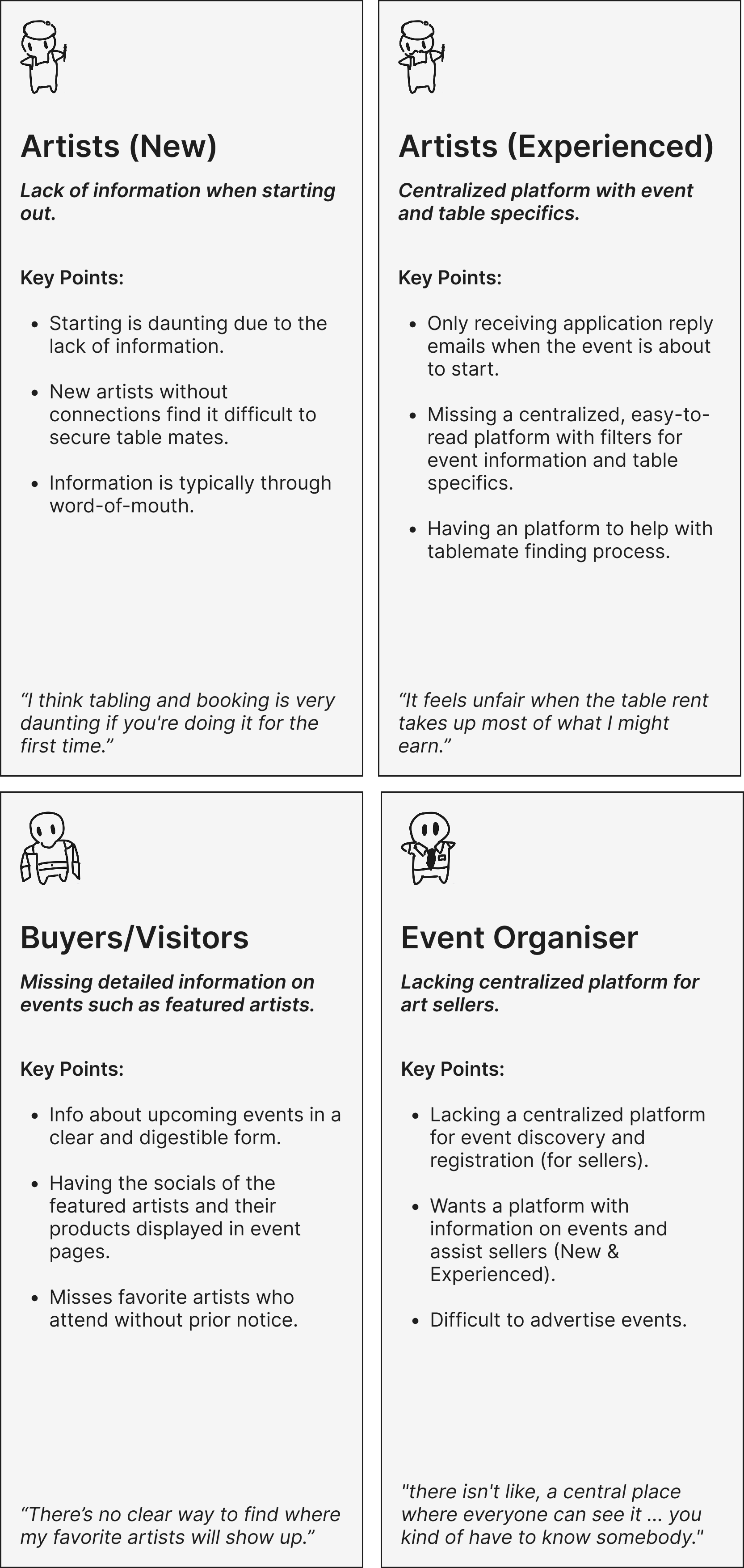
The interviews revealed that artists consistently struggle with scattered and unreliable tabling information spread across Discord, Instagram, and word-of-mouth networks. Both new and experienced artists described difficulties finding accurate details on table pricing, registration, and preparation, often leading to confusion or missed opportunities. Many also noted a heavy reliance on a few “connector” artists to redistribute information, creating inconvenience for both sharers and seekers.
Participants expressed a strong desire for a centralized, trustworthy platform that consolidates event details, offers guidance, and supports community interaction, including advice-sharing and finding tablemates. These insights validated the core need that shaped Artlink: to provide a clear, organized, and community-driven space that simplifies the tabling experience for all artists.
Participants expressed a strong desire for a centralized, trustworthy platform that consolidates event details, offers guidance, and supports community interaction, including advice-sharing and finding tablemates. These insights validated the core need that shaped Artlink: to provide a clear, organized, and community-driven space that simplifies the tabling experience for all artists.
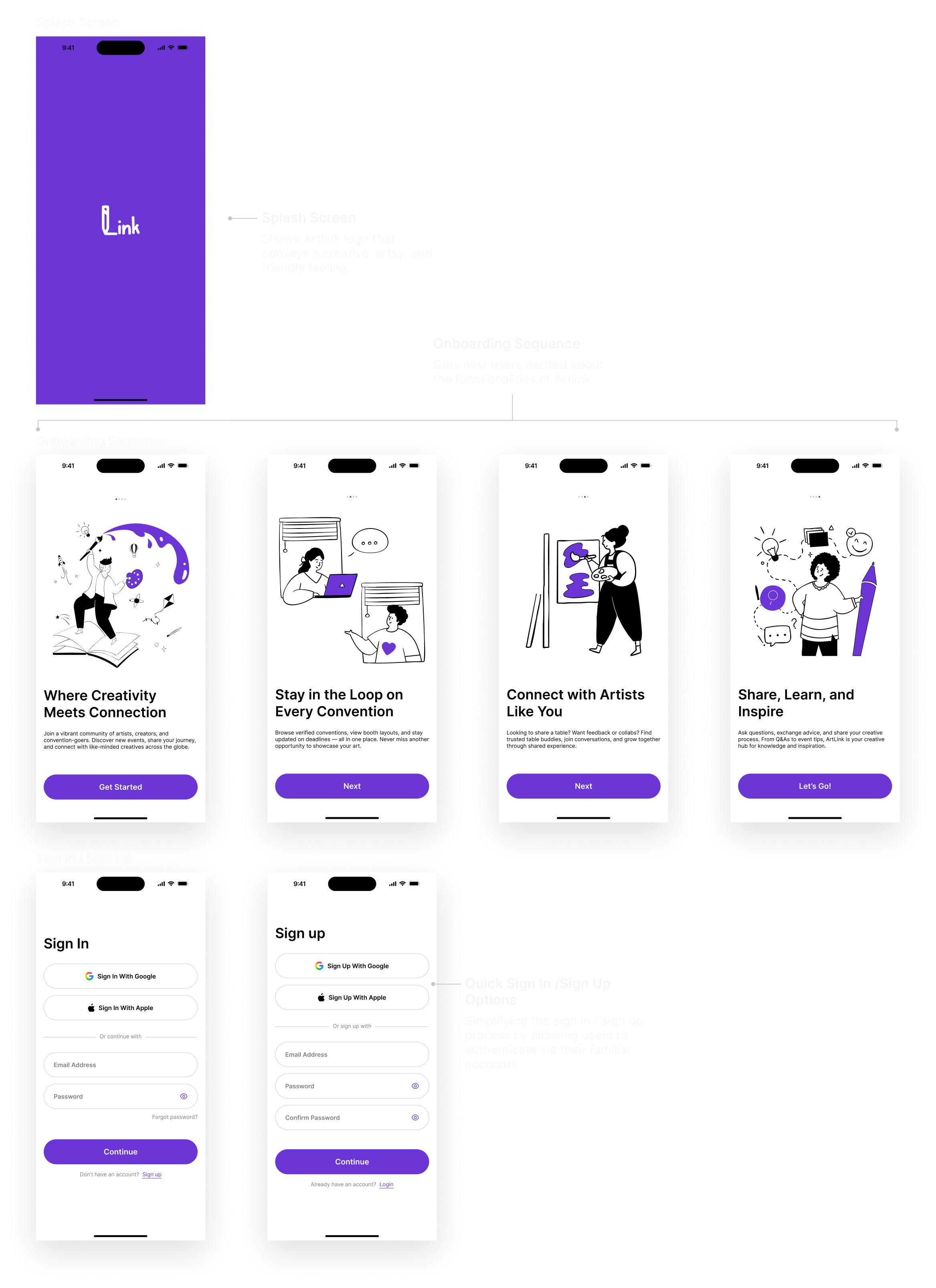
Early Design Idea
Splash
Event Details
Tabling
Suggestions
Based on our findings and user research, each team member was tasked with generating an initial design concept that addressed the core challenges within the problem domain.
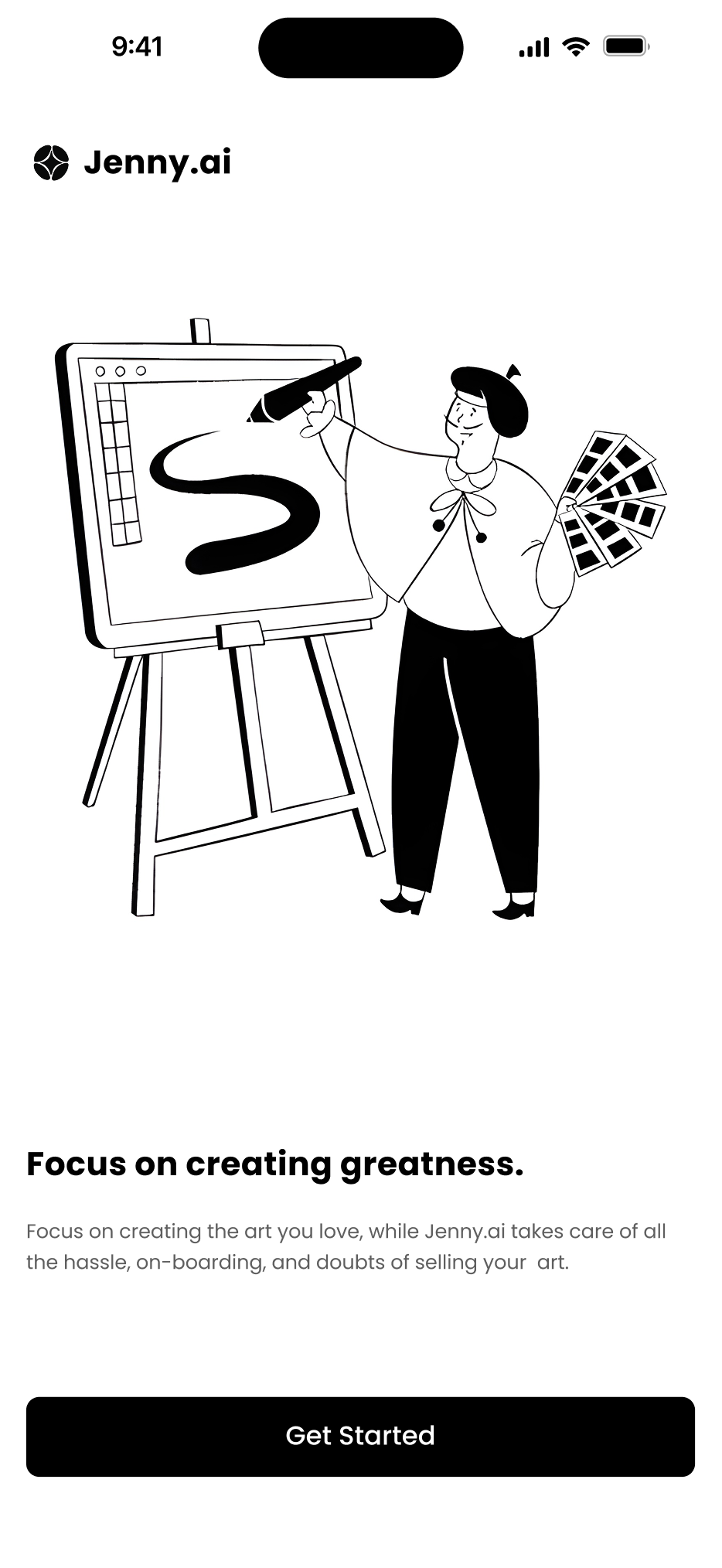
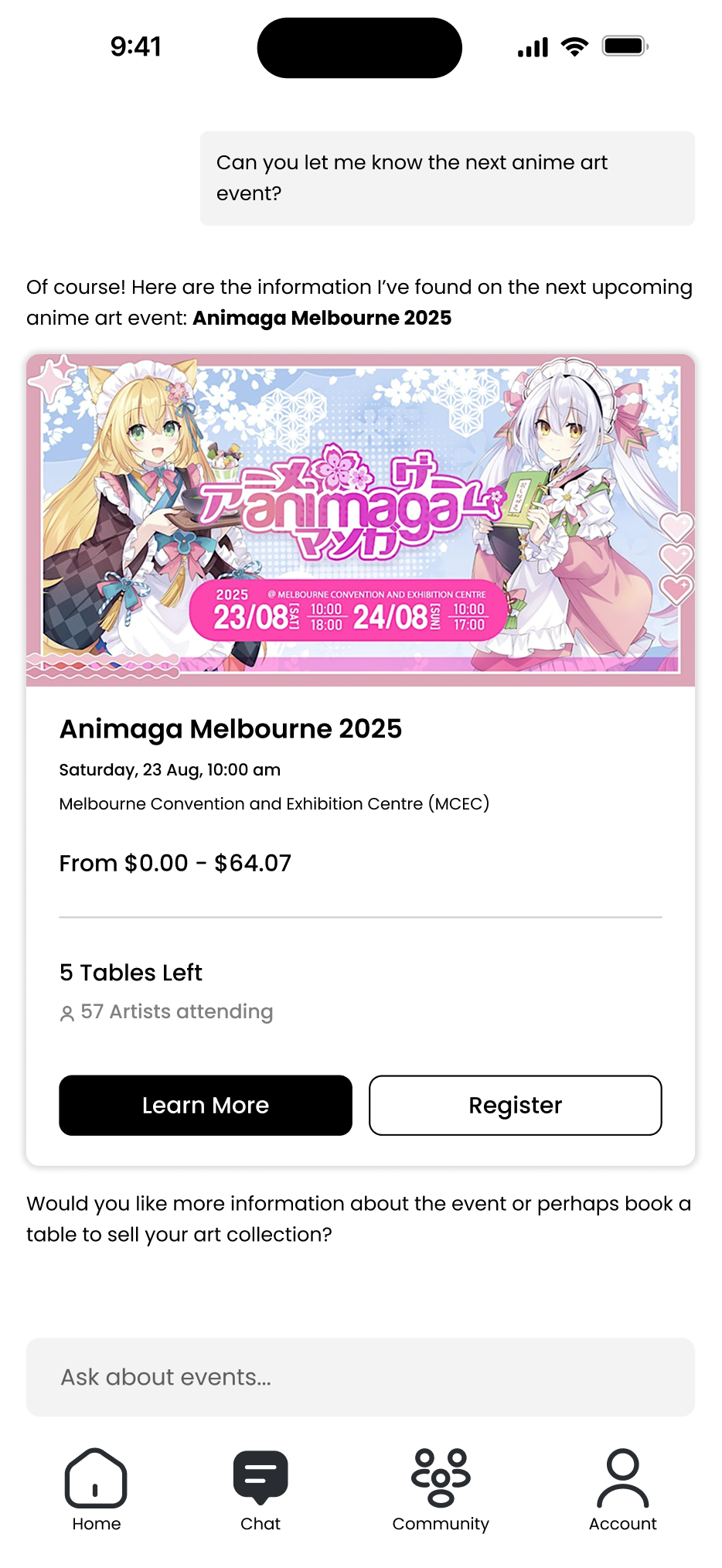
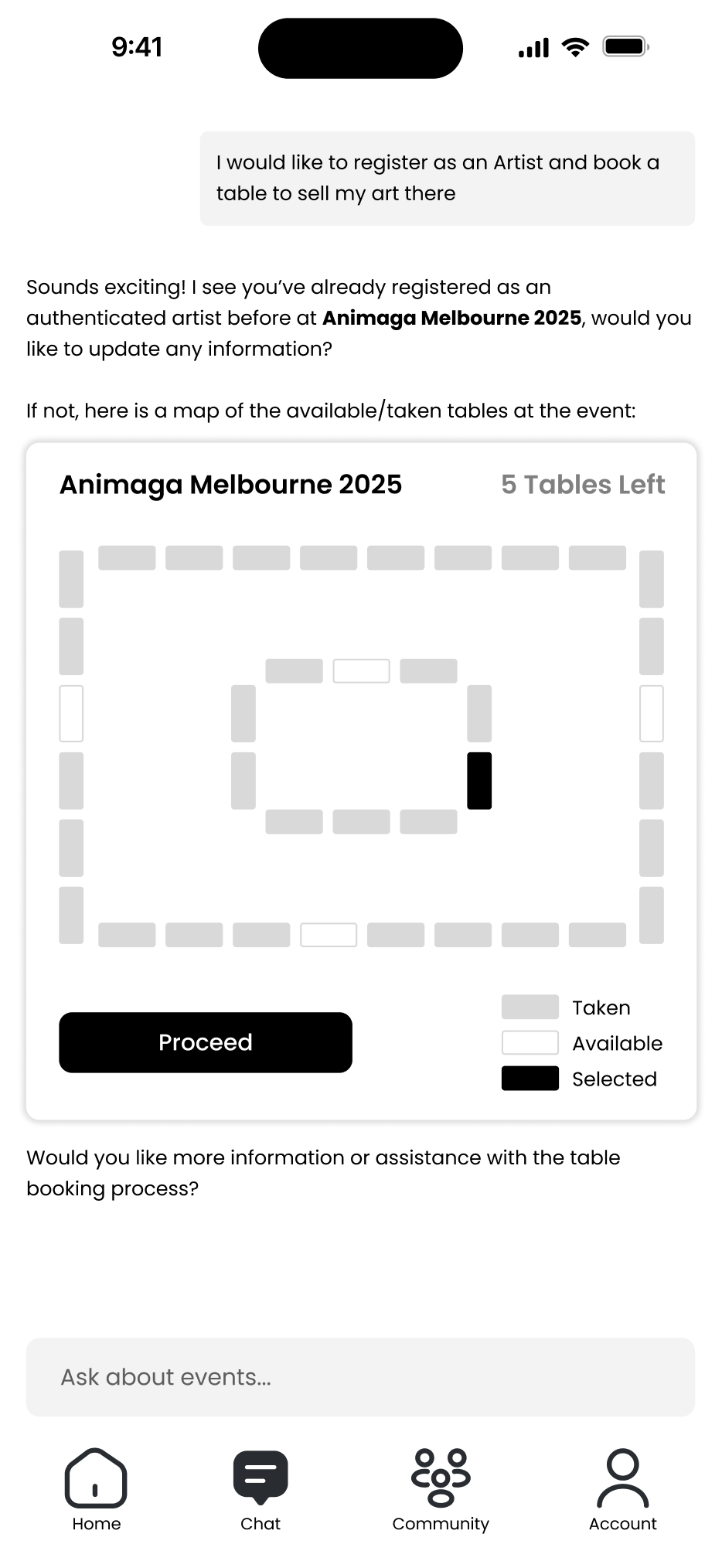
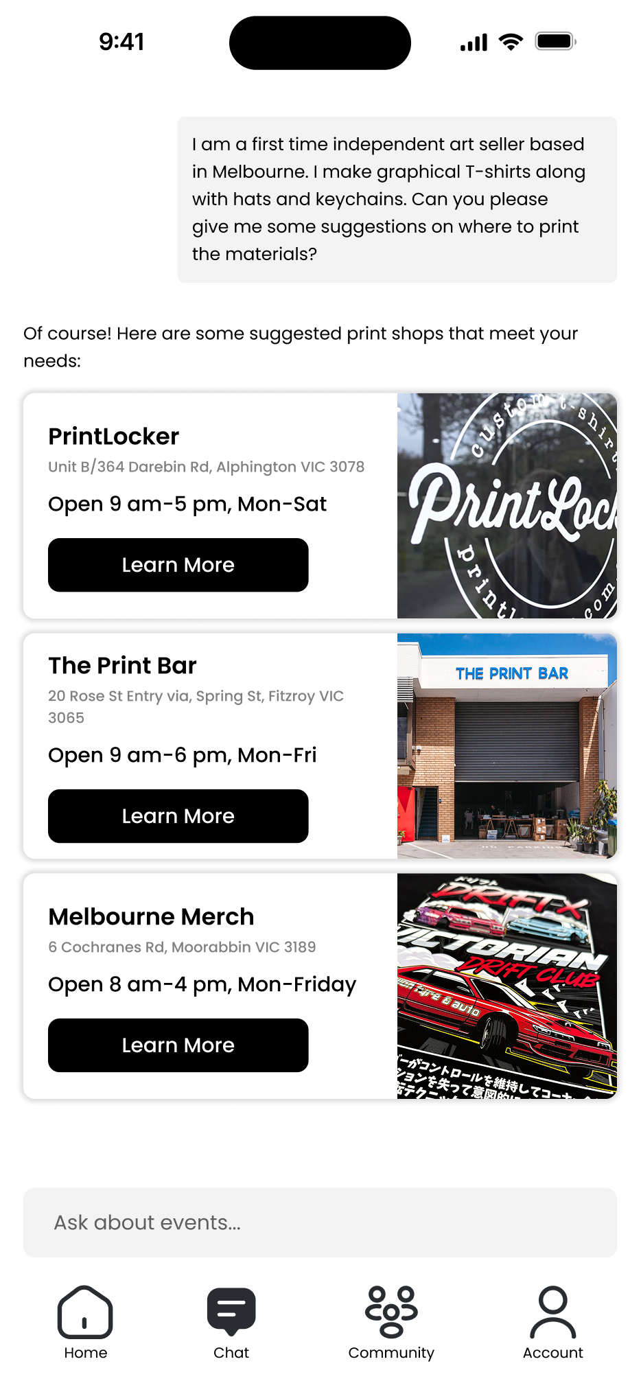
For my early concept, I created Jenny.ai, an app centered around an AI assistant designed to guide artists through the tabling process. Jenny.ai would provide up-to-date details on upcoming events, information on table applications, and tailored suggestions on topics such as printing, pricing, and travel preparation. The idea was to give artists, regardless of experience level, access to reliable information and on-demand support, similar to consulting an experienced artist. The assistant could also recommend local printing services with competitive pricing, helping users make informed, cost-effective decisions.
For my early concept, I created Jenny.ai, an app centered around an AI assistant designed to guide artists through the tabling process. Jenny.ai would provide up-to-date details on upcoming events, information on table applications, and tailored suggestions on topics such as printing, pricing, and travel preparation. The idea was to give artists, regardless of experience level, access to reliable information and on-demand support, similar to consulting an experienced artist. The assistant could also recommend local printing services with competitive pricing, helping users make informed, cost-effective decisions.
Early Design Feedback
After flushing out the screens for our early designs, we had users provide feedback on them. The follow were some comments for Jenny.ai:
Areas of Improvement:
Areas of Improvement:
UI Design: The users thought the minimalistic look of the UI feels too corporate, lacking personality for an app that is targeted towards artists. They mentioned the app would benefit from personalization and customization options, allowing each user to freely express their artistic style through the UI. This concept is similar to Discord for its profile customizability.
AI Chatbot: Some participants didn’t like the idea of talking with an AI chatbot. They mentioned a preference of talking and taking advice from real peers and artists instead of an automated system.
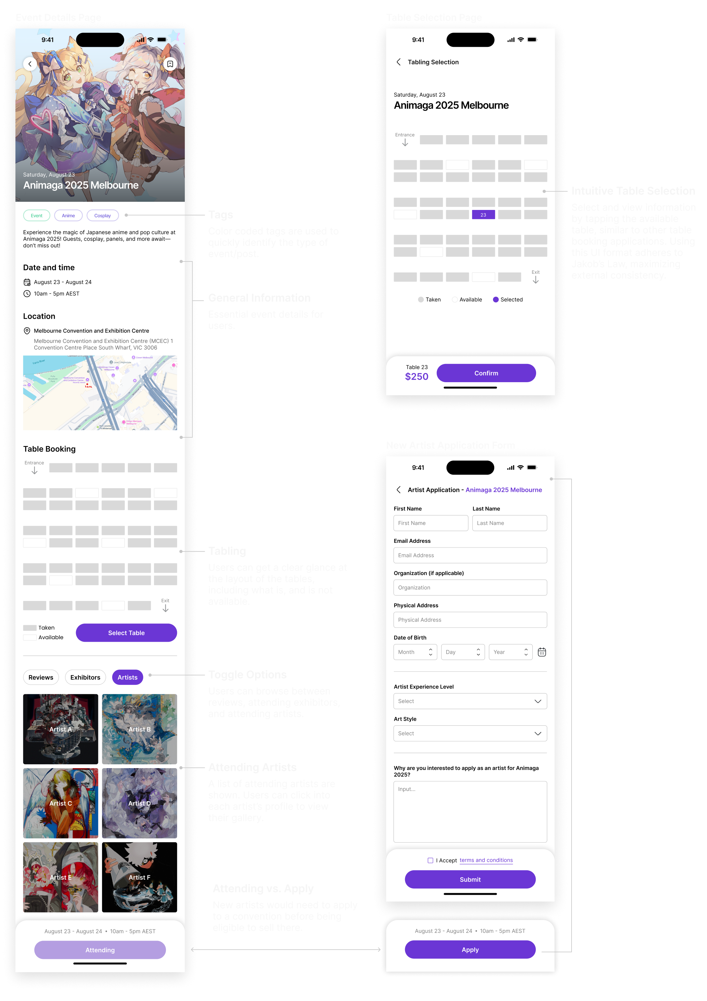
Areas of Improvement:
Areas of Improvement:
Table rental and selection UI: All of the participants liked the UI design for tabling section. They mentioned it is similar to the tools they are already used to, such as movie theater and concert booking, making it more intuitive to use.
Main Design Concept (MDC)
After consolidating our feedback and advices, we’ve landed on our Main Design Concept (MDC), a north star to follow through out the rest of the project:
A community platform where artists can connect with each other to find table buddies, receive/give advice, and view event information.
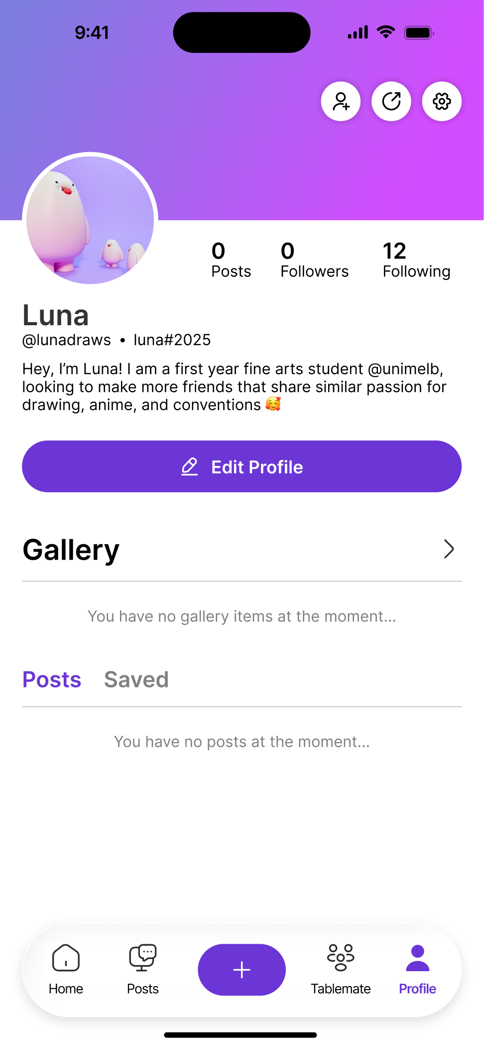
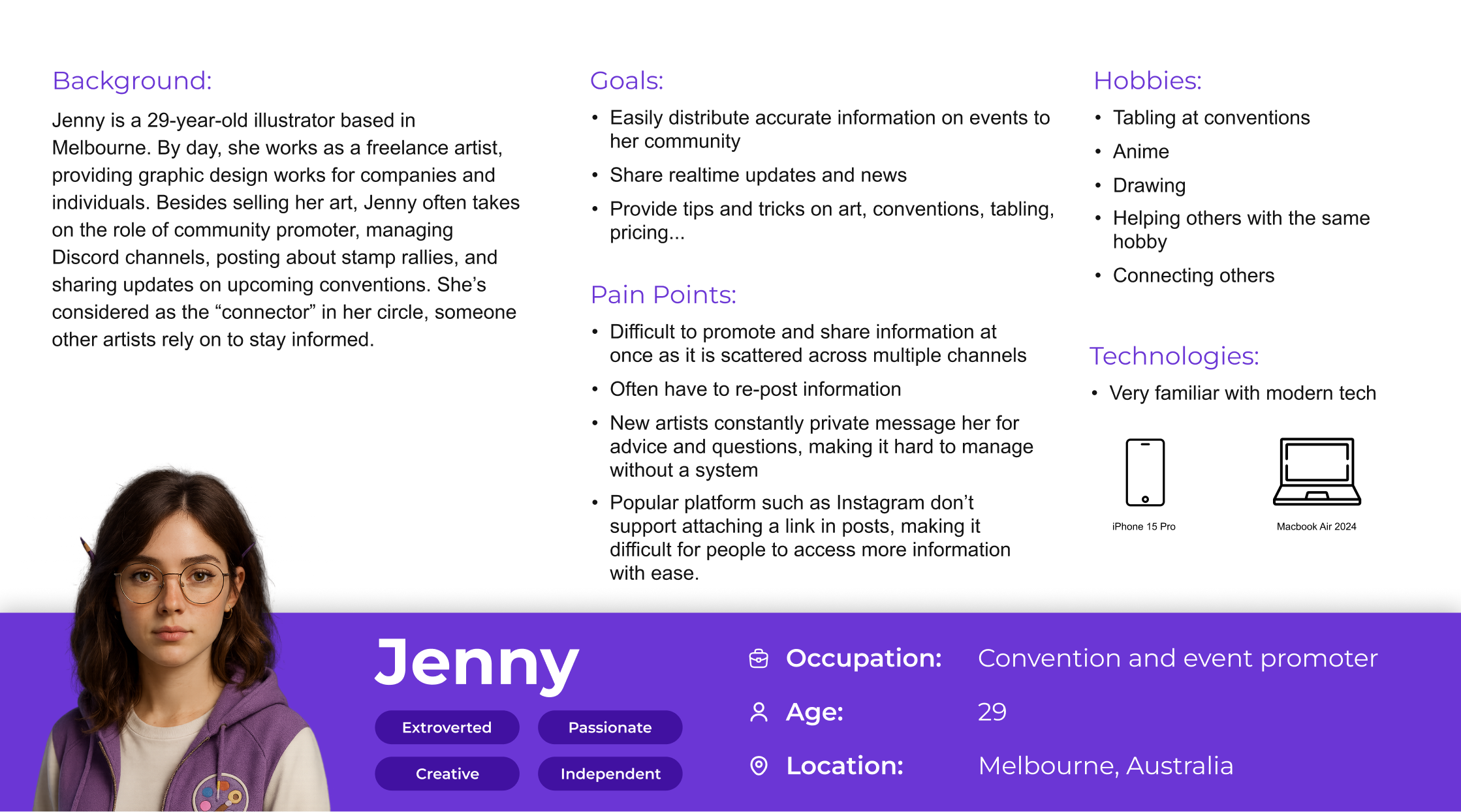
Persona
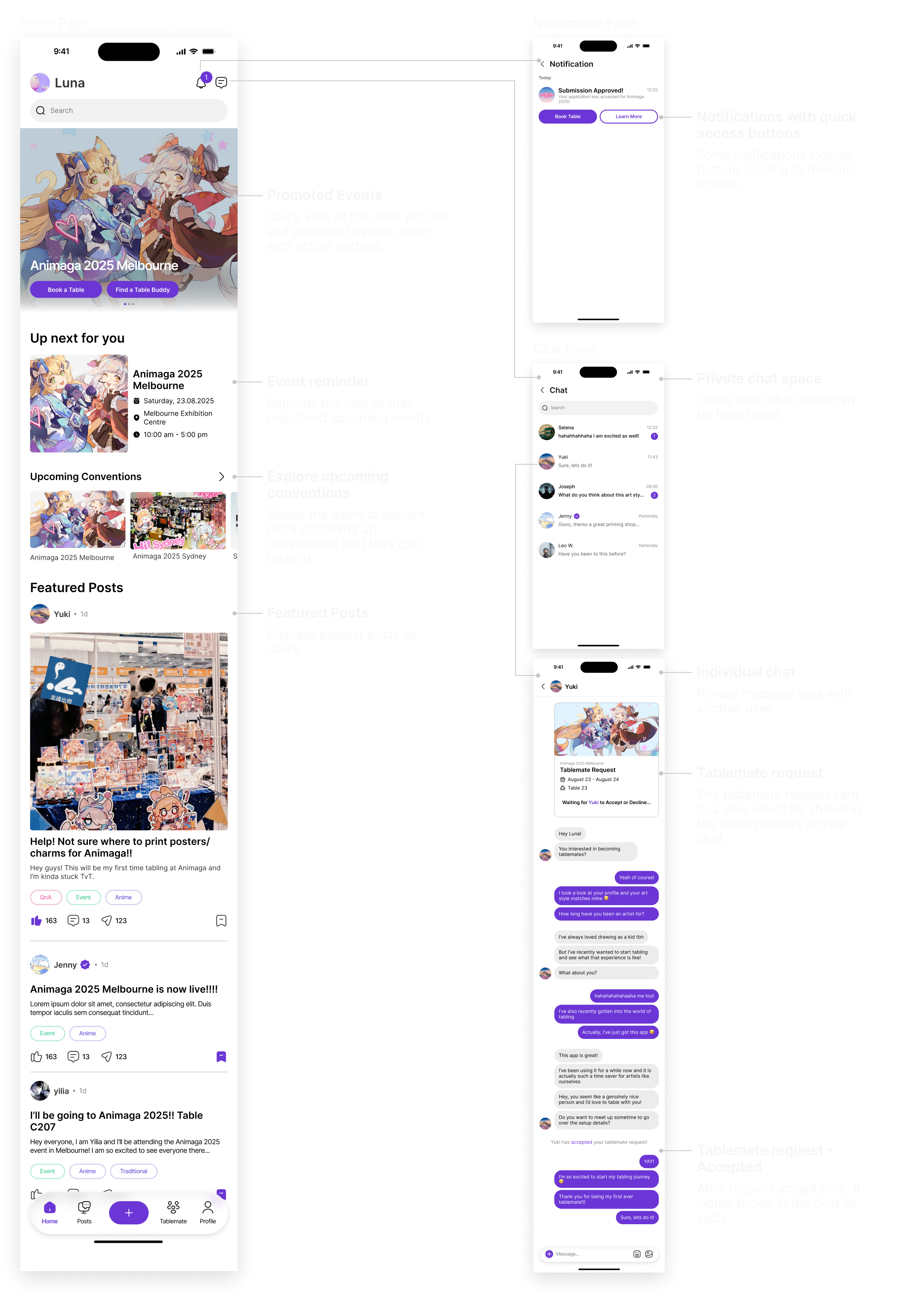
Ideation & Early Prototypes
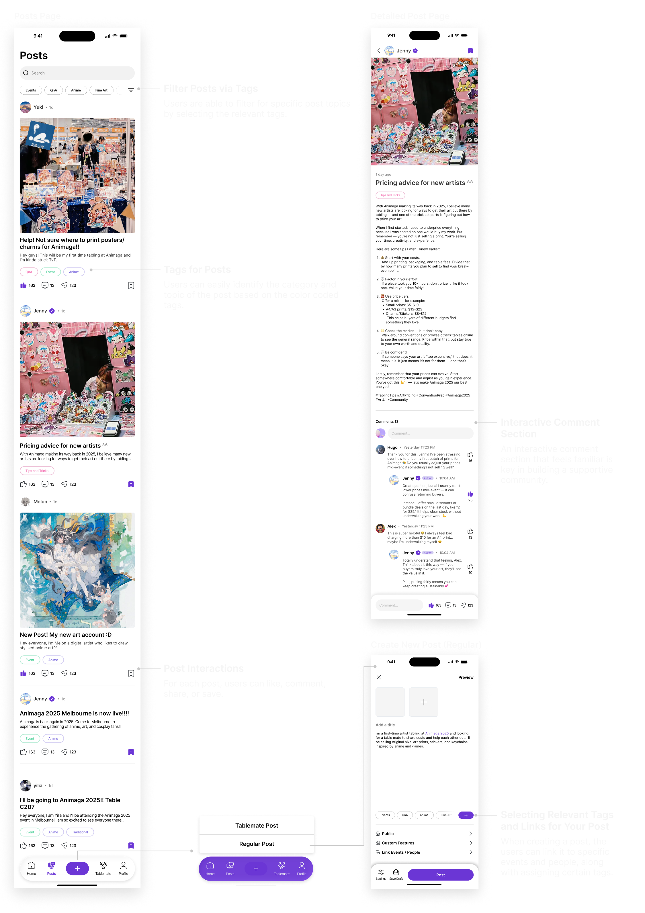
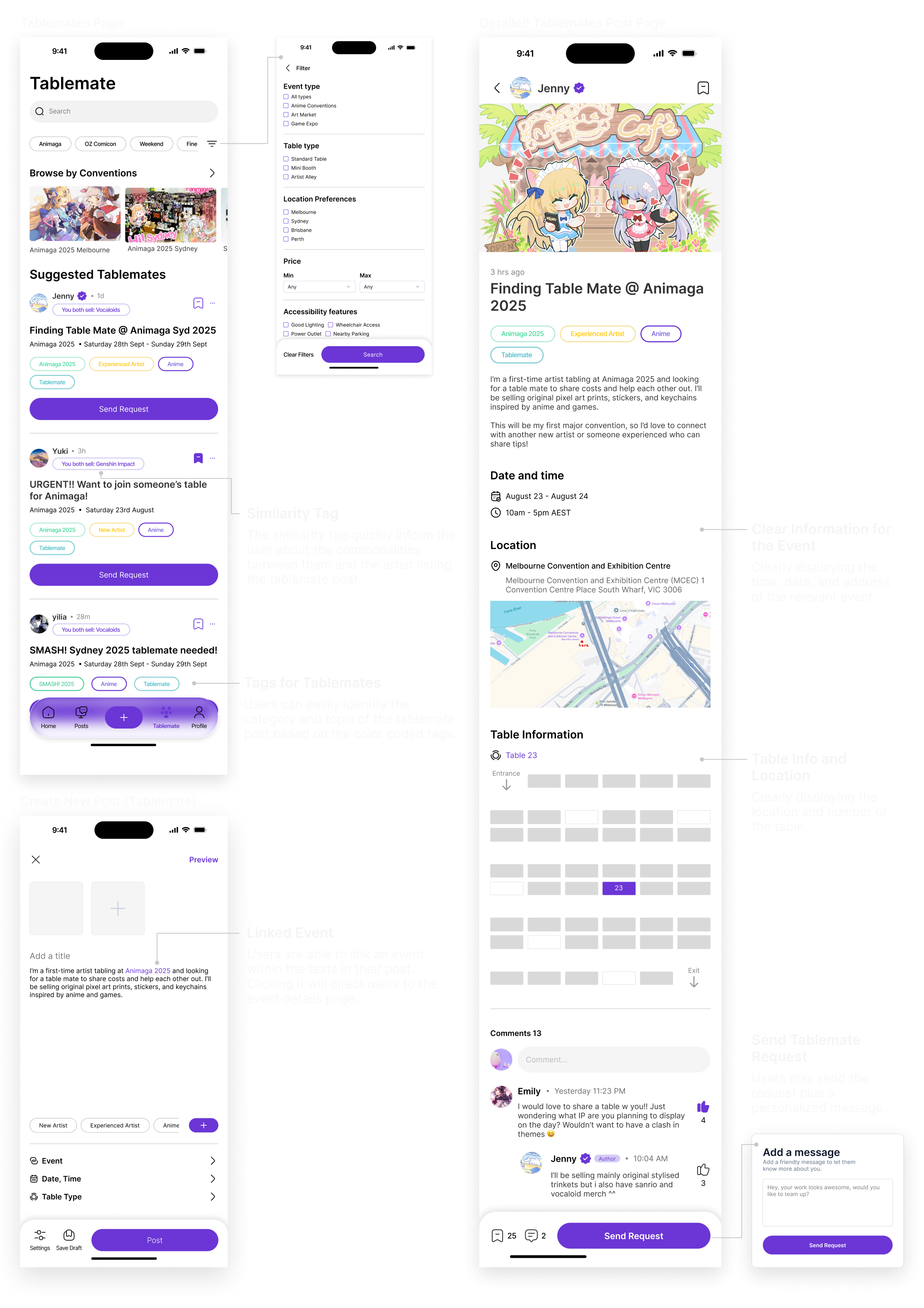
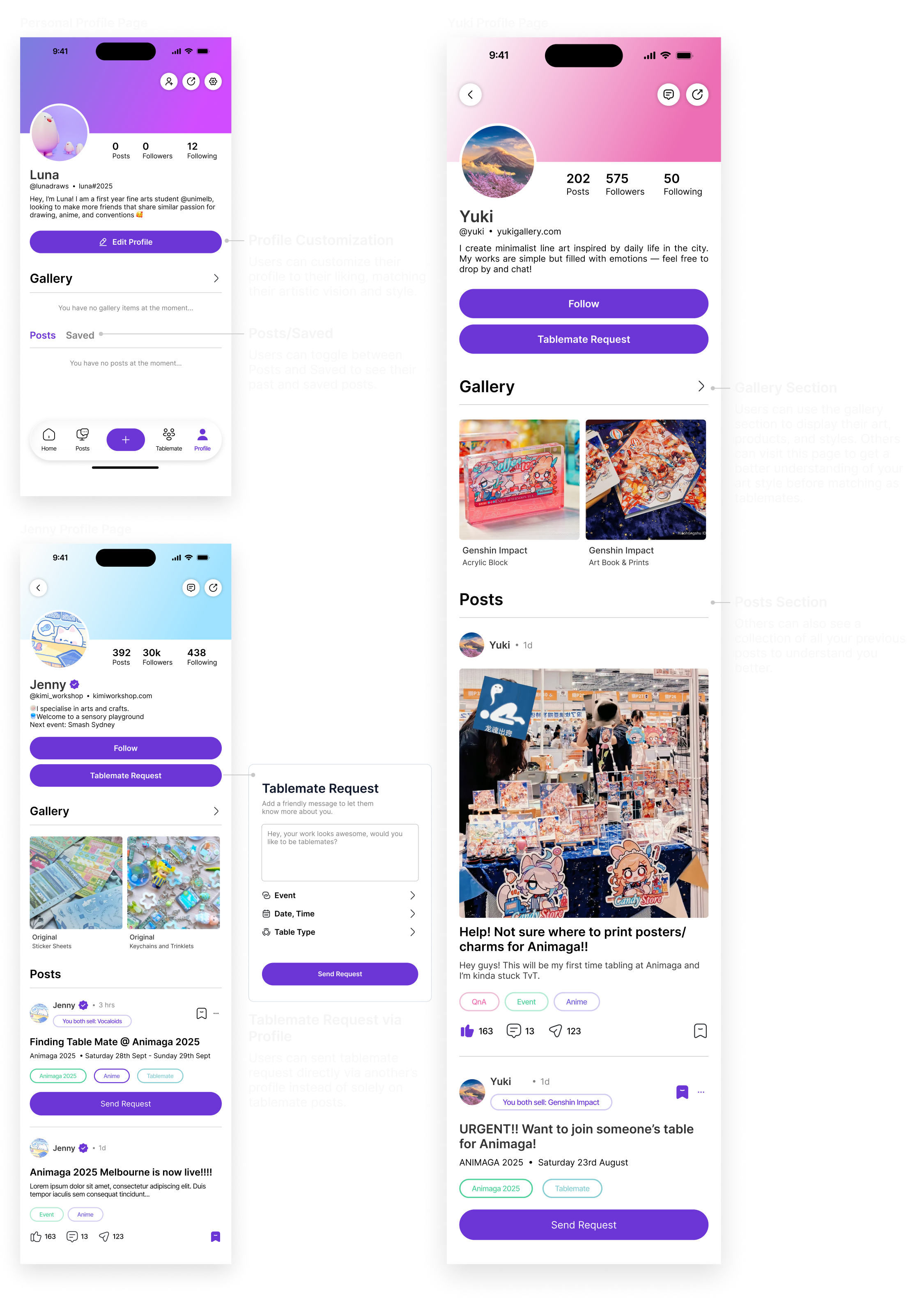
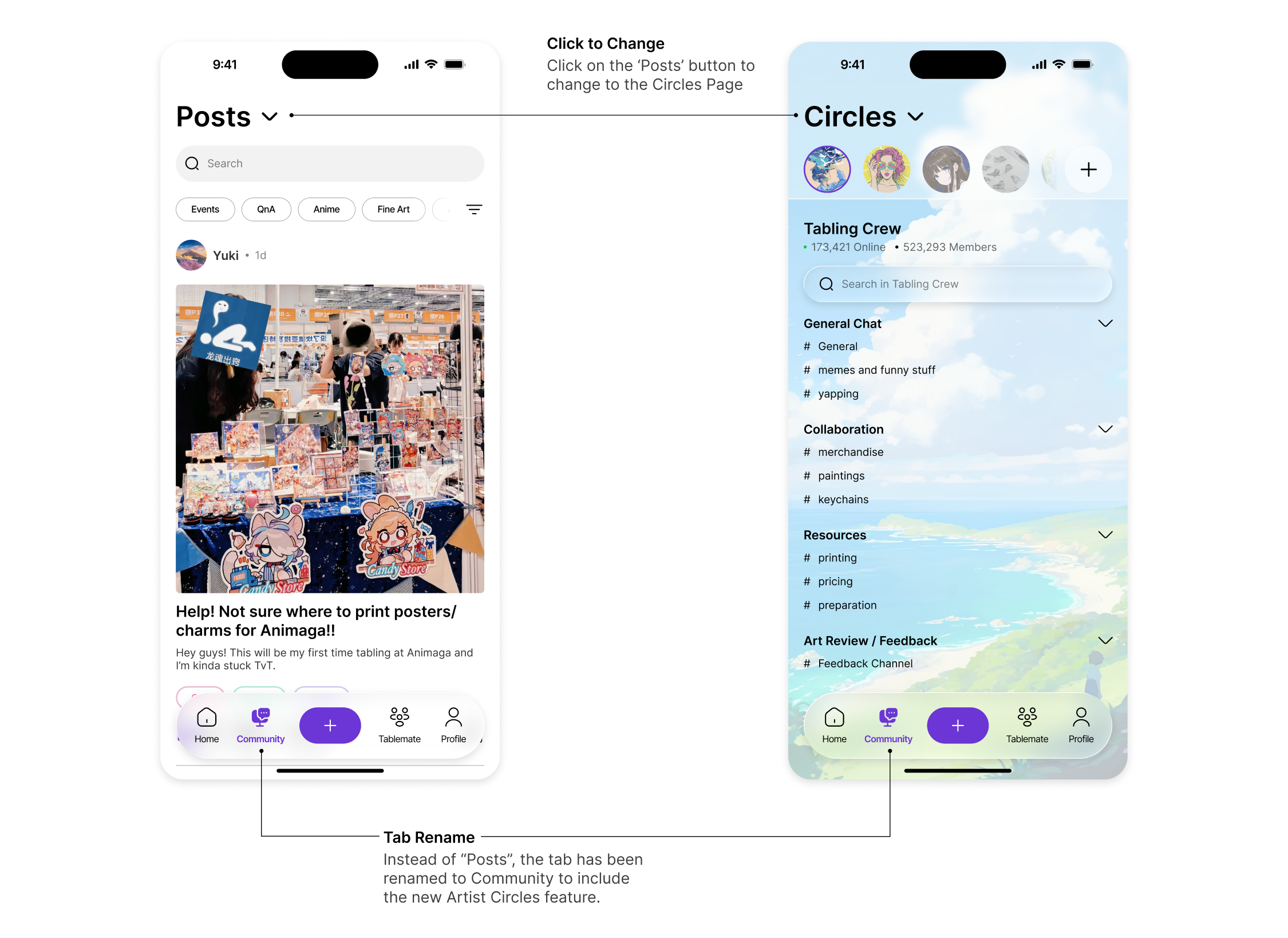
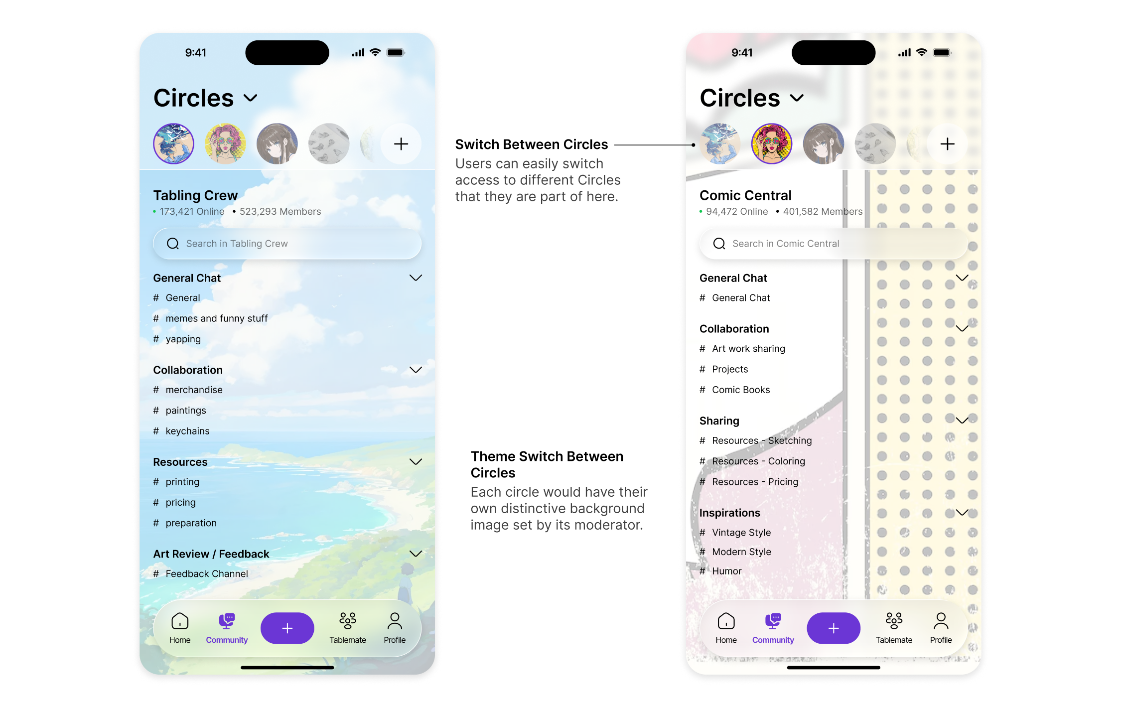
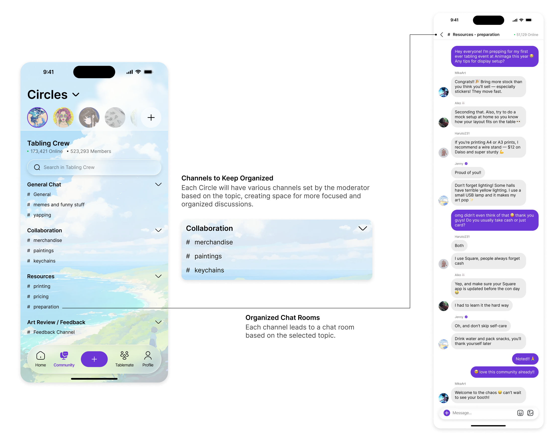
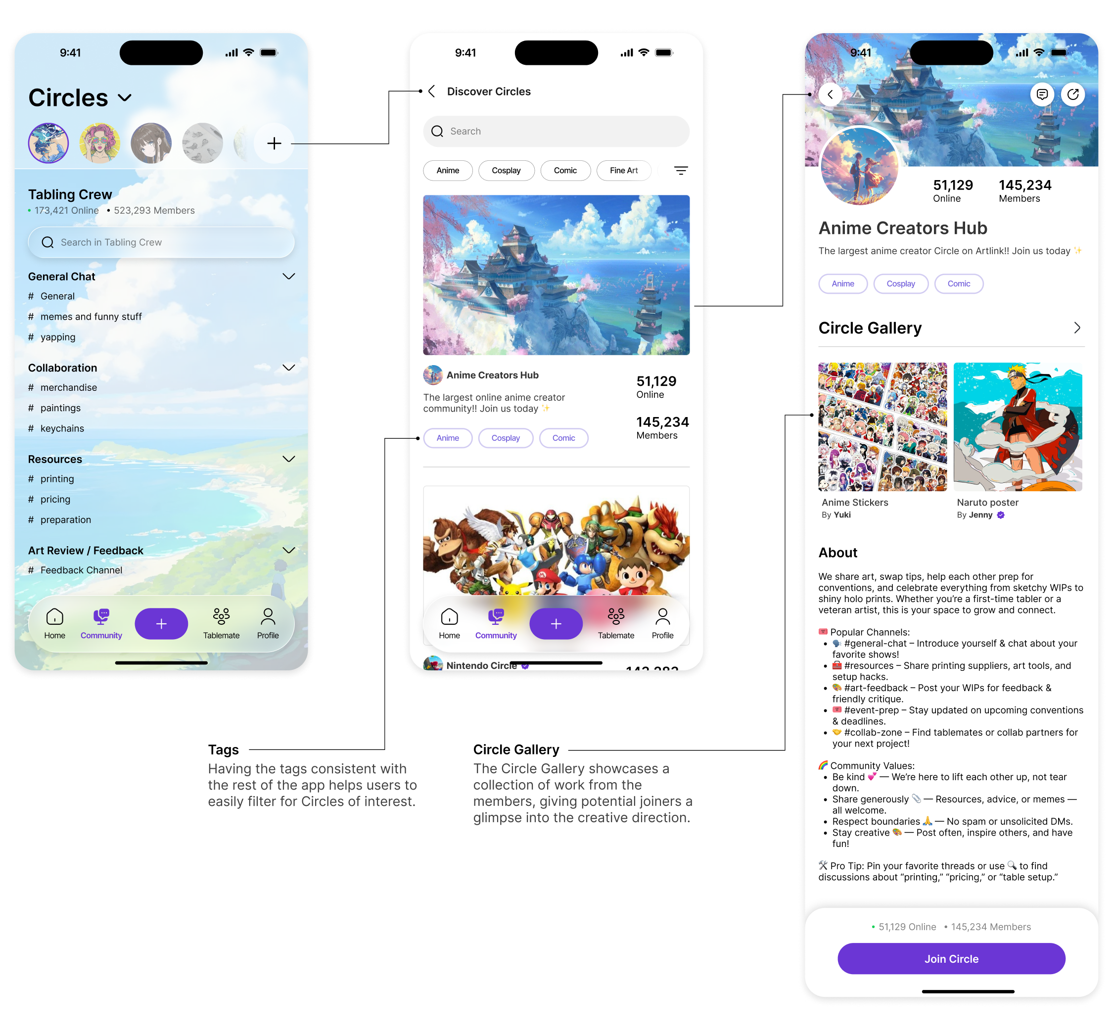
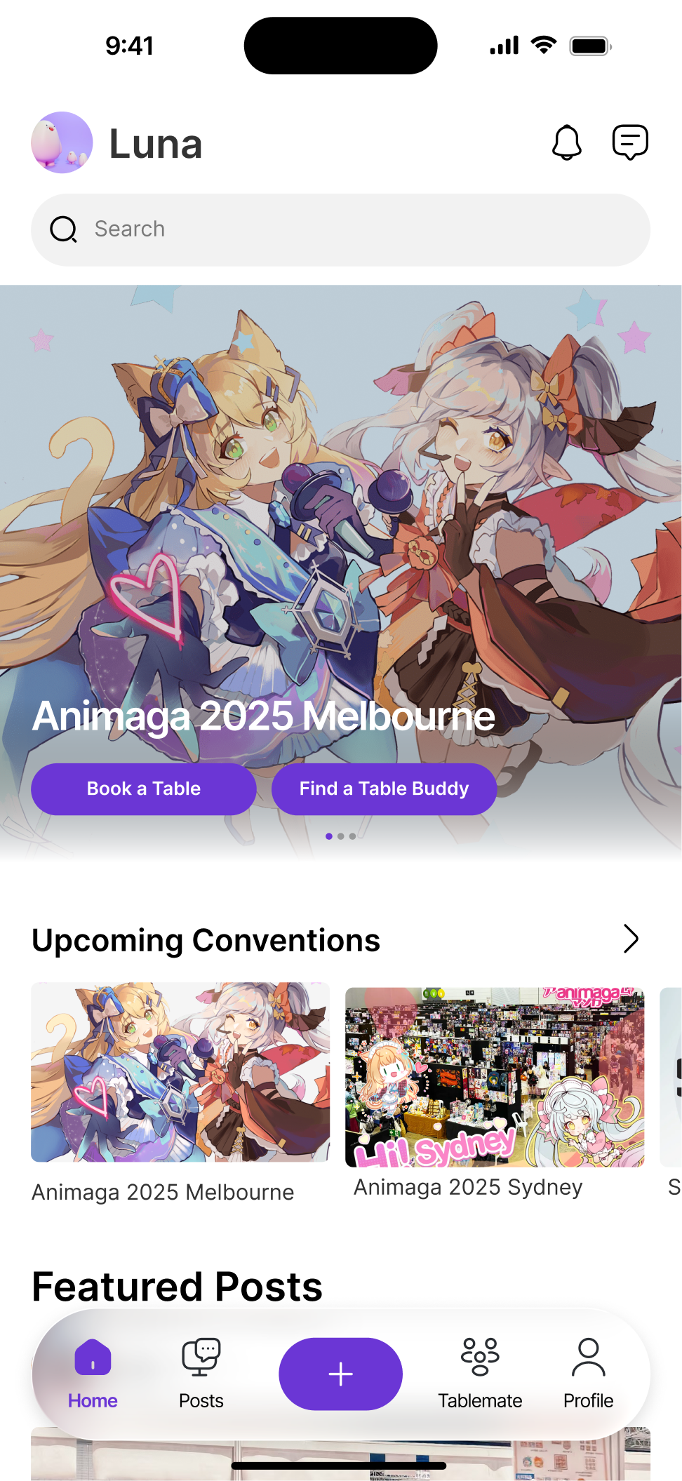
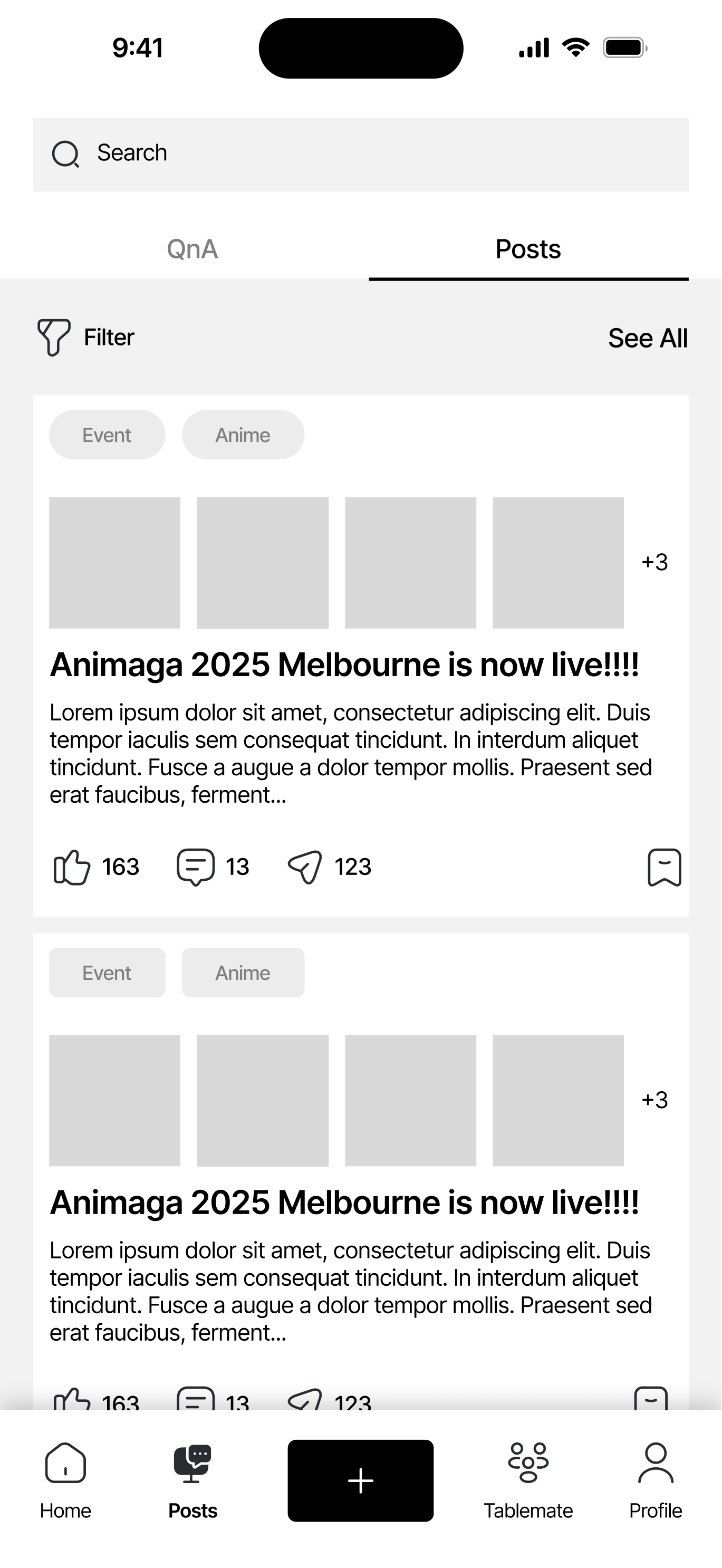
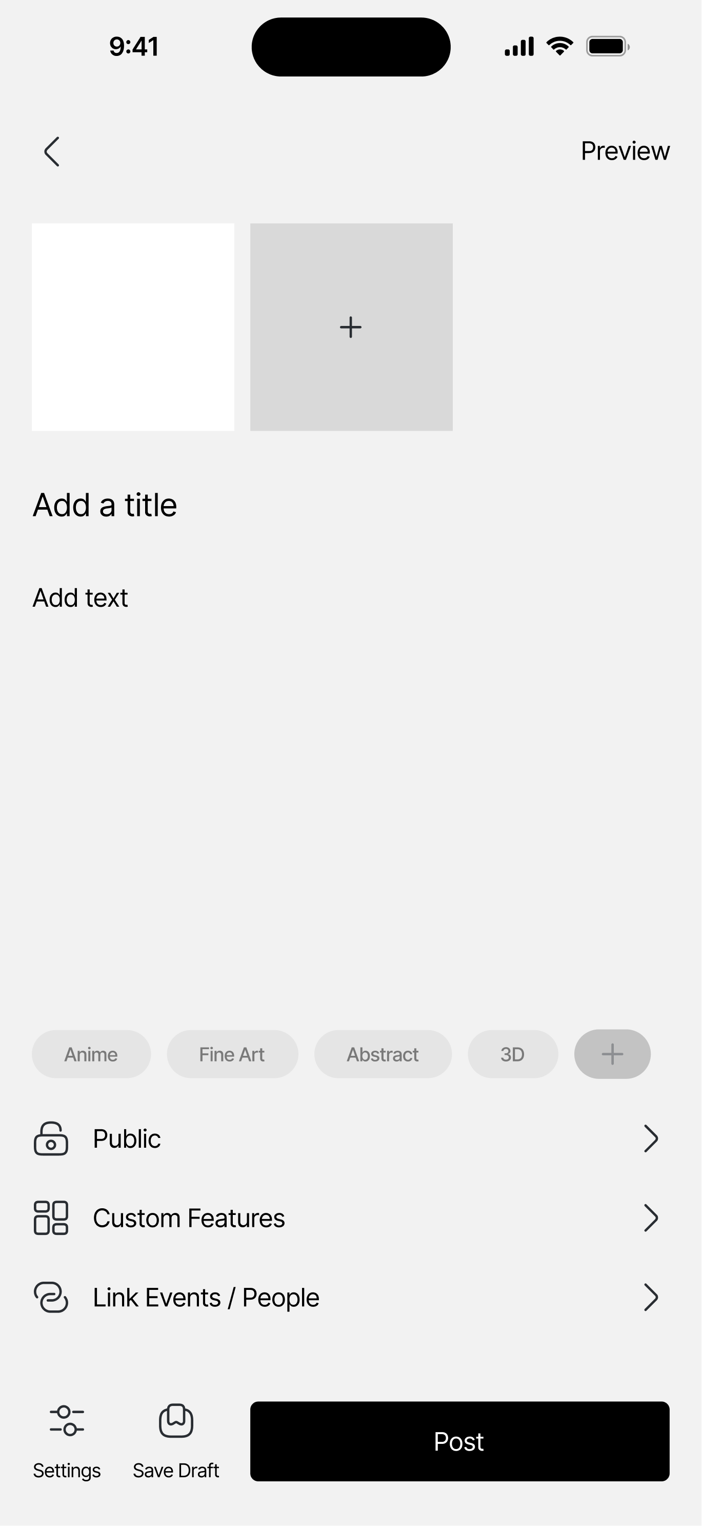
With the MDC identified, the team was able to get our directions aligned. We each took on a few key pages of the app and started designing the wireframes for it. For me, my job was to design the Home, Posts, and Create a Post pages.
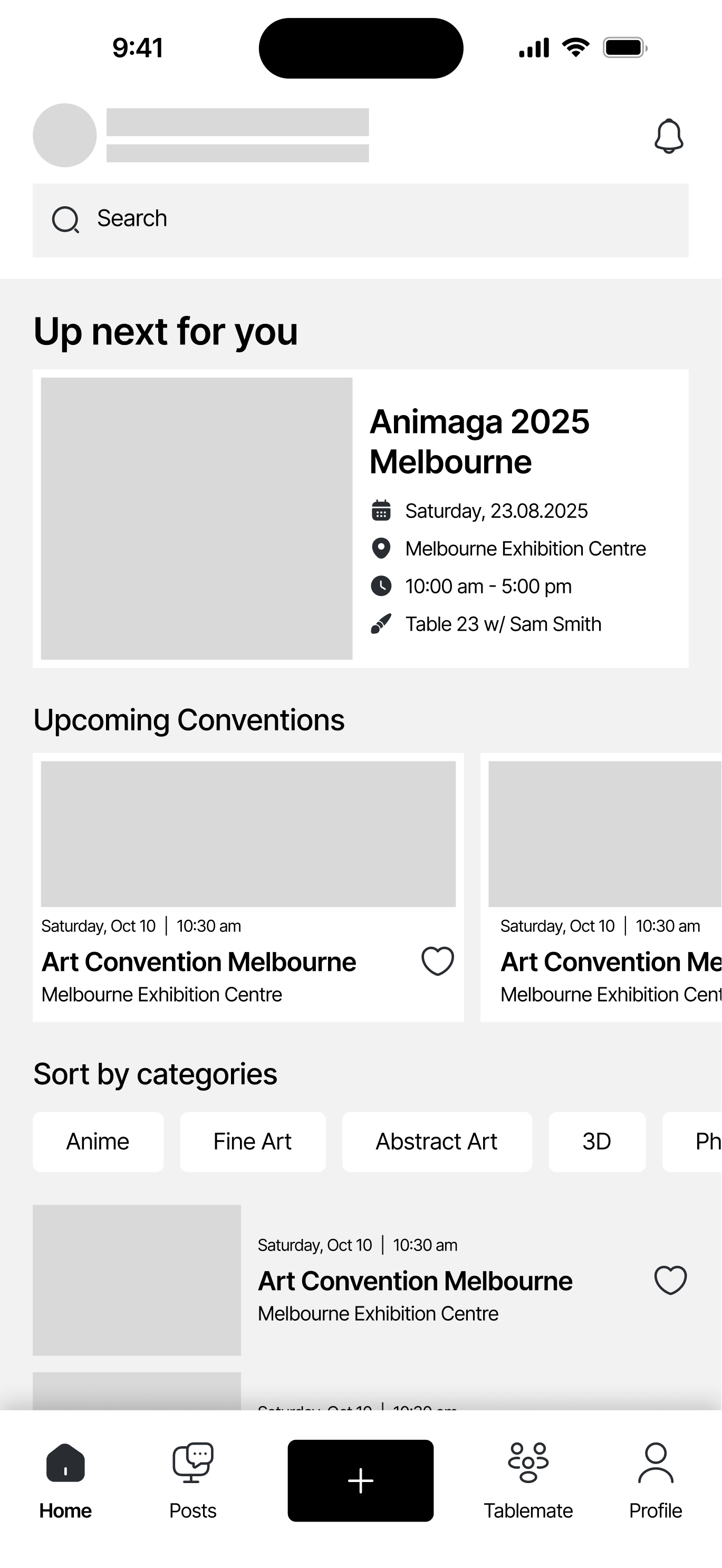
Design Goal:
Prioritizes information hierarchy and presentation, ensuring the app is simple and intuitive to navigate around.
Design Ideas:
Clear labels + icons to easily recognize actions
Organized categorization
Using tags and labels to easily identify similar events
Outcome:
Clarity on presenting events and upcoming tasks
Clear interaction choices and options for the users
External consistency with user’s familiar tools
This design focuses on the 4th Usability Heuristics by Jakob Nielsen: Consistency and Standards. While designing the wireframes, I wanted to focus on:
Maintaining a low learning curve for new users:
Maintaining a low learning curve for new users:
Making sure the layout, interaction, and feel of the app can resemble the other digital products that the users are familiar with.
For example, the posting page is similar to the posts in Twitter/Facebook/Instagram
Keeping Internal and External Consistency:
Keeping Internal and External Consistency:
The fonts, buttons, and icons have a fixed standard of design across the whole application, minimizing confusion amongst users (INTERNAL)
The design style of the application is similar to the ones that the users are already used to using (EXTERNAL)
Clarity on where to find information:
Clarity on where to find information:
Relevant information are grouped together for a easier navigation experience
Tags and labels are used to easily identify similar groups of information