Overview
The HUA Festival, a festival that celebrates the beauty of Chinese culture, explores the traditions and practices through three core pillars: Food/Beverage, Fashion, and Art. This self-developed festival includes formulating the strategy, positioning, and branding design, ensuring the event is unique yet feasible. The project is part of a graphic design studio class.
Timeline
March 2025 - June 2025
Type
University Solo Project
Role
Graphic Designer, Researcher
Tools
Adobe Illustrator
|
Adobe Photoshop
|
Figma
|
Procreate
Context
In a global cultural landscape that increasingly values authenticity and elevated experiences, there is a growing demand for festivals that both celebrate heritage and embrace contemporary aesthetics. Melbourne hosts a wide range of cultural and luxury events, yet few, if any, merge the two through a Chinese lens.
As someone deeply connected to my Chinese heritage and drawn to premium experiences, I was inspired to explore how the two could be meaningfully intertwined. This led to the concept of a festival that reinterprets Chinese tradition through a refined, contemporary lens. Rather than portraying culture as static or purely traditional, the vision is to create a curated space where the richness of Chinese food, fashion, and art is not only celebrated but elevated, designed to resonate with a new generation of culturally curious, style-conscious, and experience-driven individuals.
As someone deeply connected to my Chinese heritage and drawn to premium experiences, I was inspired to explore how the two could be meaningfully intertwined. This led to the concept of a festival that reinterprets Chinese tradition through a refined, contemporary lens. Rather than portraying culture as static or purely traditional, the vision is to create a curated space where the richness of Chinese food, fashion, and art is not only celebrated but elevated, designed to resonate with a new generation of culturally curious, style-conscious, and experience-driven individuals.
Core Pillars
The festival will be structured across three days, with each day dedicated to one of the core pillars of Chinese heritage to offer a deep, immersive experience into each cultural domain.

Food & Beverage
Curated culinary presentations, modern Chinese gastronomy, local tea and liquor tastings.

Fashion
Runway showcases, designer exhibitions, and traditional-modern fusion of Chinese fashion.

Art
Visual installations, calligraphy performances and workshops, and contemporary Chinese artists.
Values
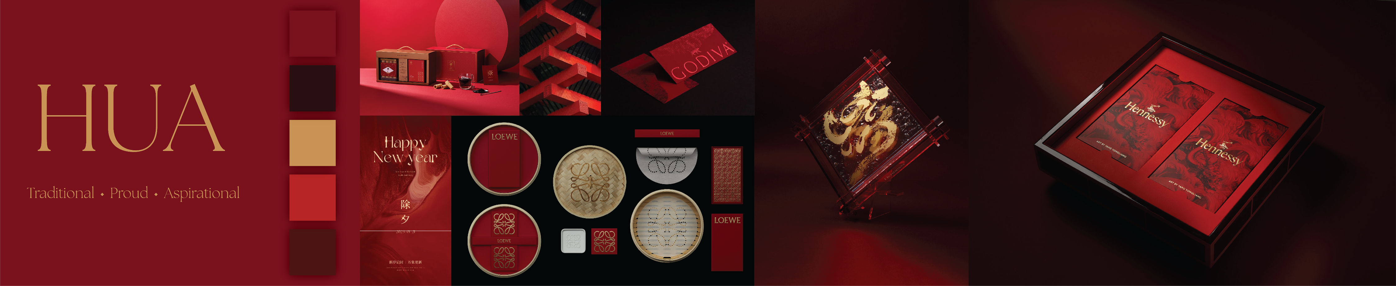
A clearly defined set of values is essential to shaping a strong and consistent branding strategy. The following guiding principles will serve as the foundation for the festival’s identity, tone, and overall experience.

Elegance
A commitment to refined aesthetics, minimalism, and timeless beauty - from branding to experience design.
Essence
Honoring the core spirit of Chinese culture, expressed with authenticity and respect. This value ensures the festival is not surface-level, but rooted in meaning.
Elevate
Uplifting Chinese traditions through contemporary design, luxury experiences, and thoughtful storytelling. The goal is to reframe culture as aspirational and evolving.
Positioning
Melbourne is home to a wide array of festivals, from multicultural street fairs to luxury food, art, and fashion events. However, there remains a distinct gap in the market: few events combine the richness of Chinese culture with the sophistication of premium, design-led experiences. This festival positions itself at the intersection of cultural heritage and modern luxury, curating Chinese food, fashion, and art through a contemporary and elevated lens. It is not just another cultural celebration, but rather a redefinition of tradition, crafted for a new generation of culturally curious, experience-driven individuals. This distinct positioning ensures the festival stands out as both culturally authentic and aesthetically focused.
Competitor Analysis

Positioning Matrix
After identifying key competitors, each was mapped onto a positioning matrix to highlight potential gaps in the market. The matrix evaluates festivals along two dimensions: the level of luxury (casual vs. luxury) and the cultural focus (general vs. culturally specific). This visual framework helped clarify where existing festivals are concentrated and where untapped opportunities lie.
The matrix depicted many existing festivals in Melbourne are designed to be broadly accessible to the general public. While this approach ensures inclusivity, it often lacks the specificity needed to engage niche audiences, particularly those with refined tastes and a deeper appreciation for Chinese culture and heritage. This opens an opportunity to create a festival that caters to high-end, culturally curious individuals seeking elevated and meaningful experiences.
Based on the positioning matrix, clear opportunities emerge in the upper right quadrant, where both cultural specificity and luxury intersect. While the bottom left quadrant represents accessible and generalized offerings, it falls outside the scope of this festival’s vision. Given the original intent to curate a premium cultural experience, it makes strategic sense to focus on the untapped potential of the top right quadrant, a space currently underserved in Melbourne’s festival landscape. This is where the festival can confidently position itself: as a refined, culturally expressive experience designed for discerning audiences.
Strategy
With the foundational understanding of the current situation of the market and potential opportunities, it is time to develop a branding strategy for our festival to stand out from the rest. In this part, I’ve focused on three main points: identifying the target audience, locking-in our unique positioning, and highlighting the key differentiators.
Target Audience
The target demographic is focused on groups that presents the most potential interest towards the concept of the festival: a luxurious, artistic, and modern expression of the Chinese culture.

Modern Chinese Diaspora
Emotionally connected to tradition, curious about new expressions of identity.

High-Net-Worth Individuals
Seek curated, exclusive experiences that reflect cultural depth and status.

Creative Professionals and Enthusiasts
Young, urban individuals drawn to aesthetics, heritage, and innovation.

Luxury Lifestyle Consumers
Engaged with art, design, and experiences that signal taste and sophistication.
Unique Positioning
This festival occupies an under-explored space in the market where cultural specificity meets contemporary luxury. While many existing festivals in Melbourne celebrate Chinese heritage, many do so through traditional and community-based formats aimed at general audiences. Conversely, high-end festivals typically lean towards Western-centric themes, leaving a gap for events that offer both cultural richness and upscale experiences.
What sets this festival apart is its curated reinterpretation of Chinese tradition, presented through the lens of modern lifestyle and aesthetics. It doesn’t only celebrate Chinese culture, it elevates it. With a strong visual identity, refined presentation, and a clear thematic direction, the festival is designed for individuals who seek depth, intention, and elegance in their experiences.
What sets this festival apart is its curated reinterpretation of Chinese tradition, presented through the lens of modern lifestyle and aesthetics. It doesn’t only celebrate Chinese culture, it elevates it. With a strong visual identity, refined presentation, and a clear thematic direction, the festival is designed for individuals who seek depth, intention, and elegance in their experiences.

Key Differentiators
Cultural Focus
Focused solely on Chinese heritage, rather than broad Asian culture or multicultural narratives.
Curated Experience
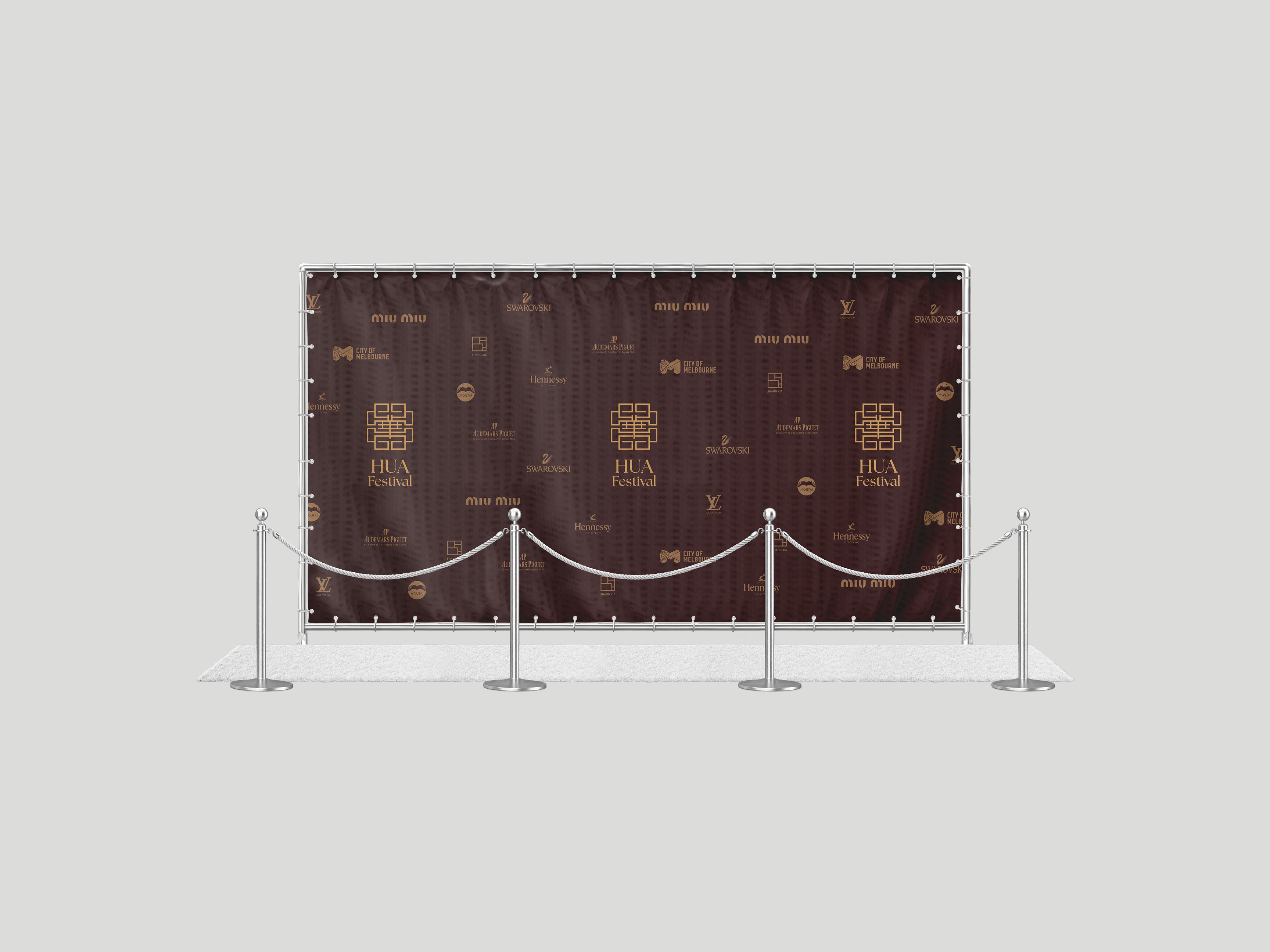
From exquisite tastings to designer showcases, it’s designed for an elevated, luxurious, and immersive sensory experience.
Modern Expression of Tradition
Exploration of a modern reinterpretation of heritage through design, storytelling, and immersion.
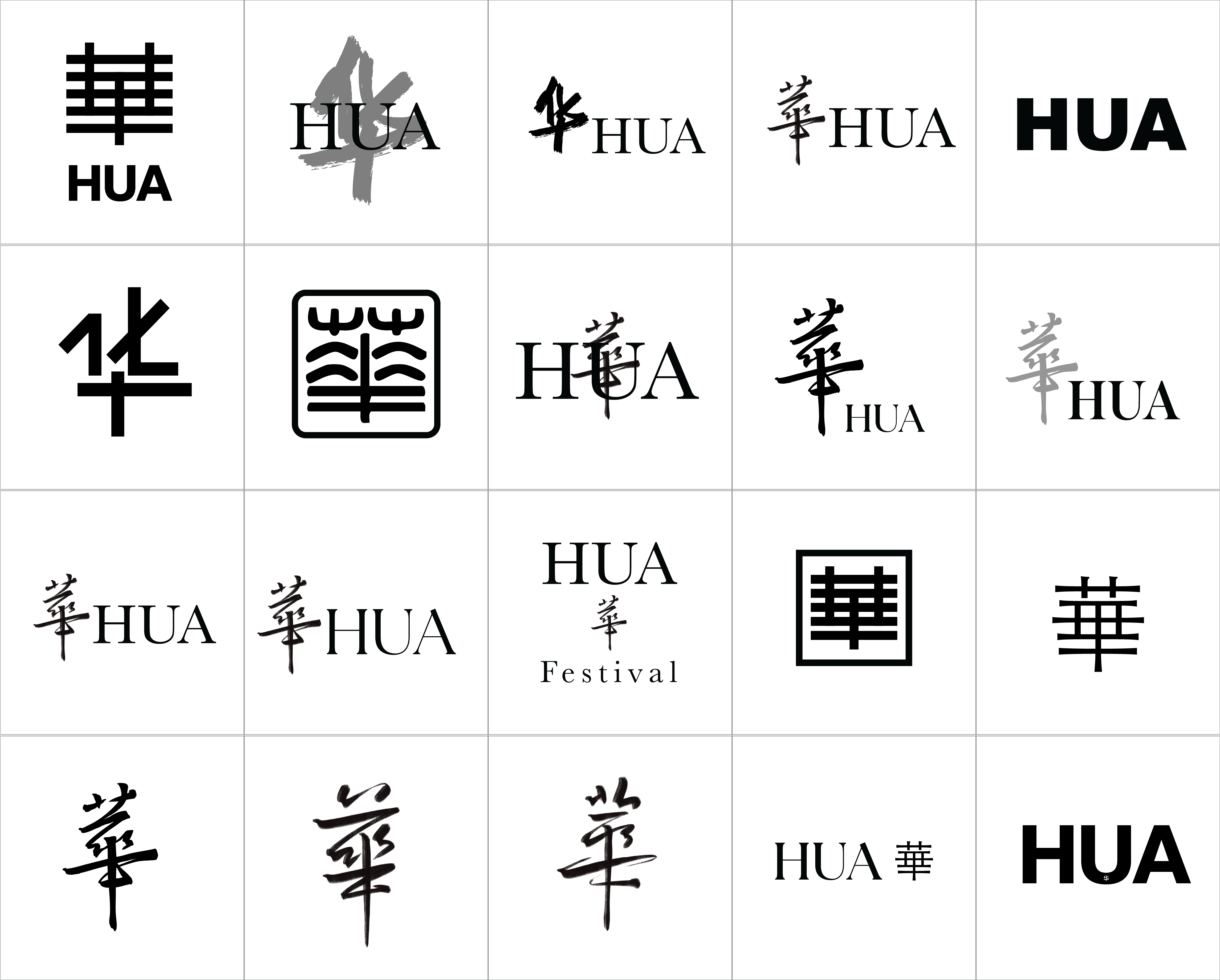
Naming
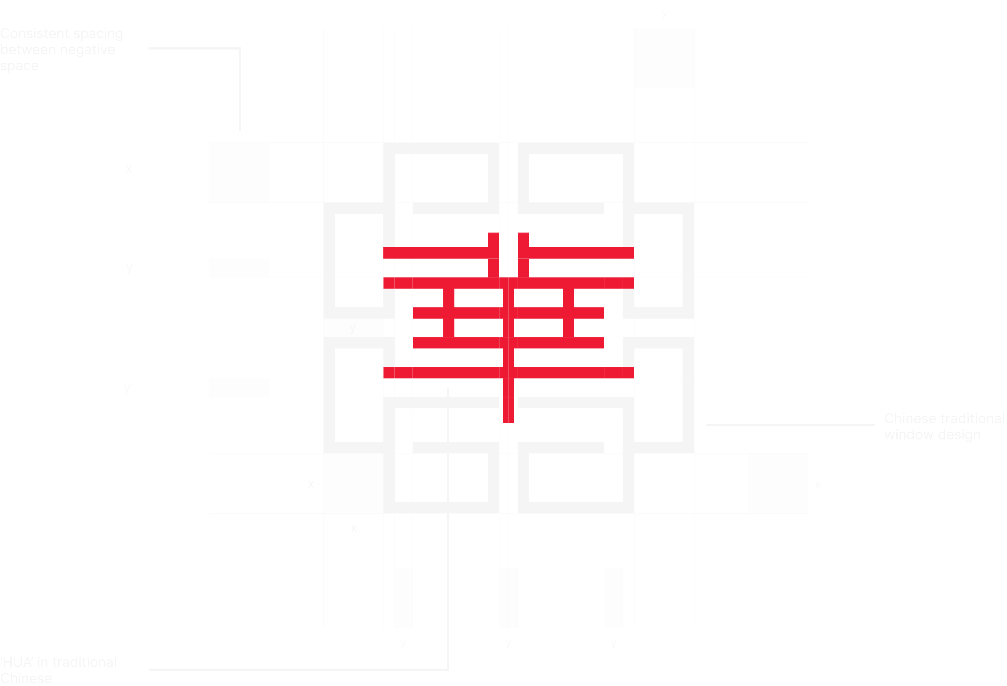
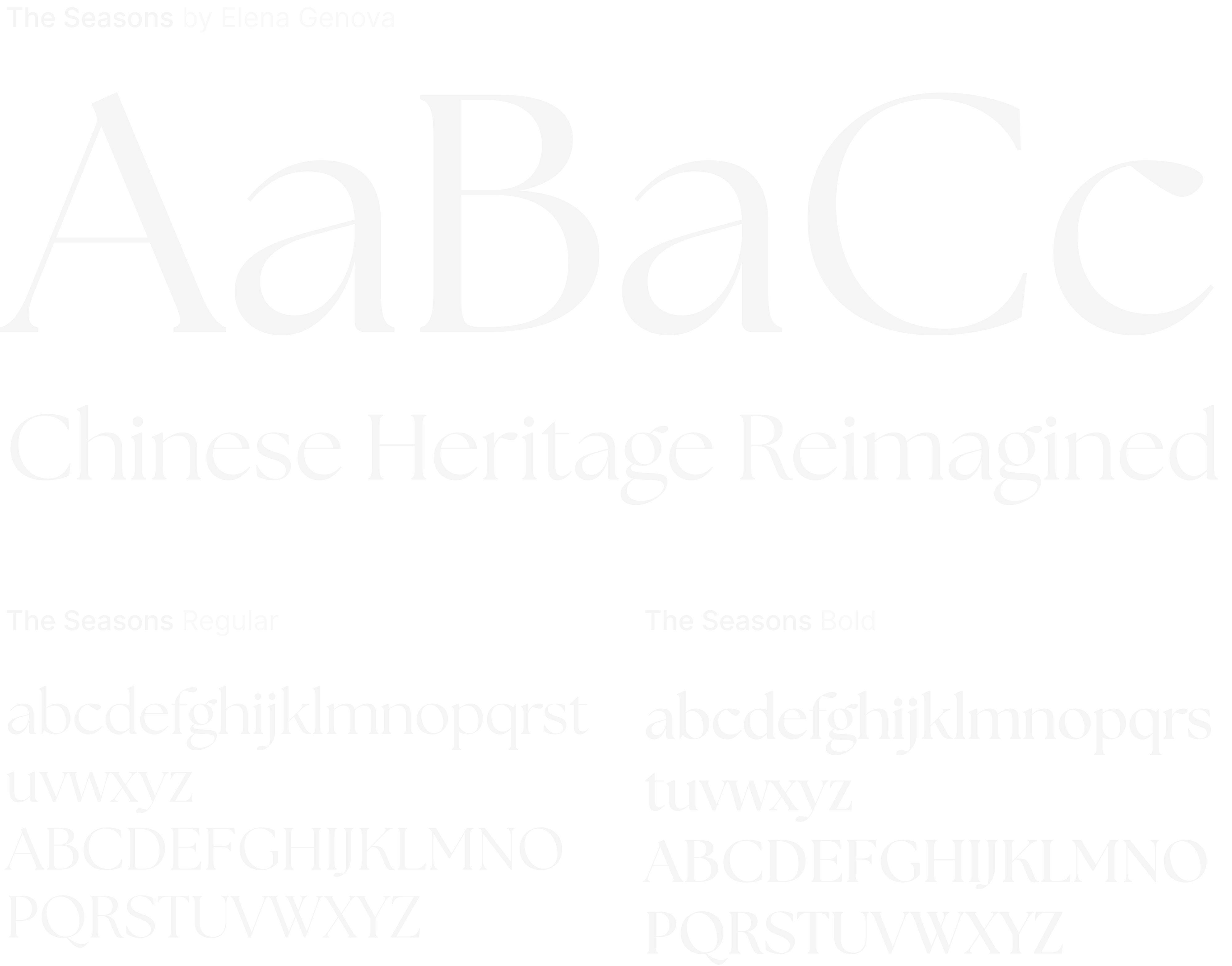
For the name of the festival, I wanted to have something that reflects more than just the event, something that carries cultural meaning, a sense of elegance, luxurious feeling, and branding potential. I began the brainstorming process by exploring various Chinese characters that resonates with the values and ideals of the brand, ideating how they could feel modern, minimal, and recognizable. The optimal name for the brand would need to sit at the intersection of authenticity and refinement. Rooted in tradition but flexible enough for contemporary expression.
After exploring various naming options in both English and Chinese, one word stood our for its simplicity, power, and resonance:
Naming Rationale
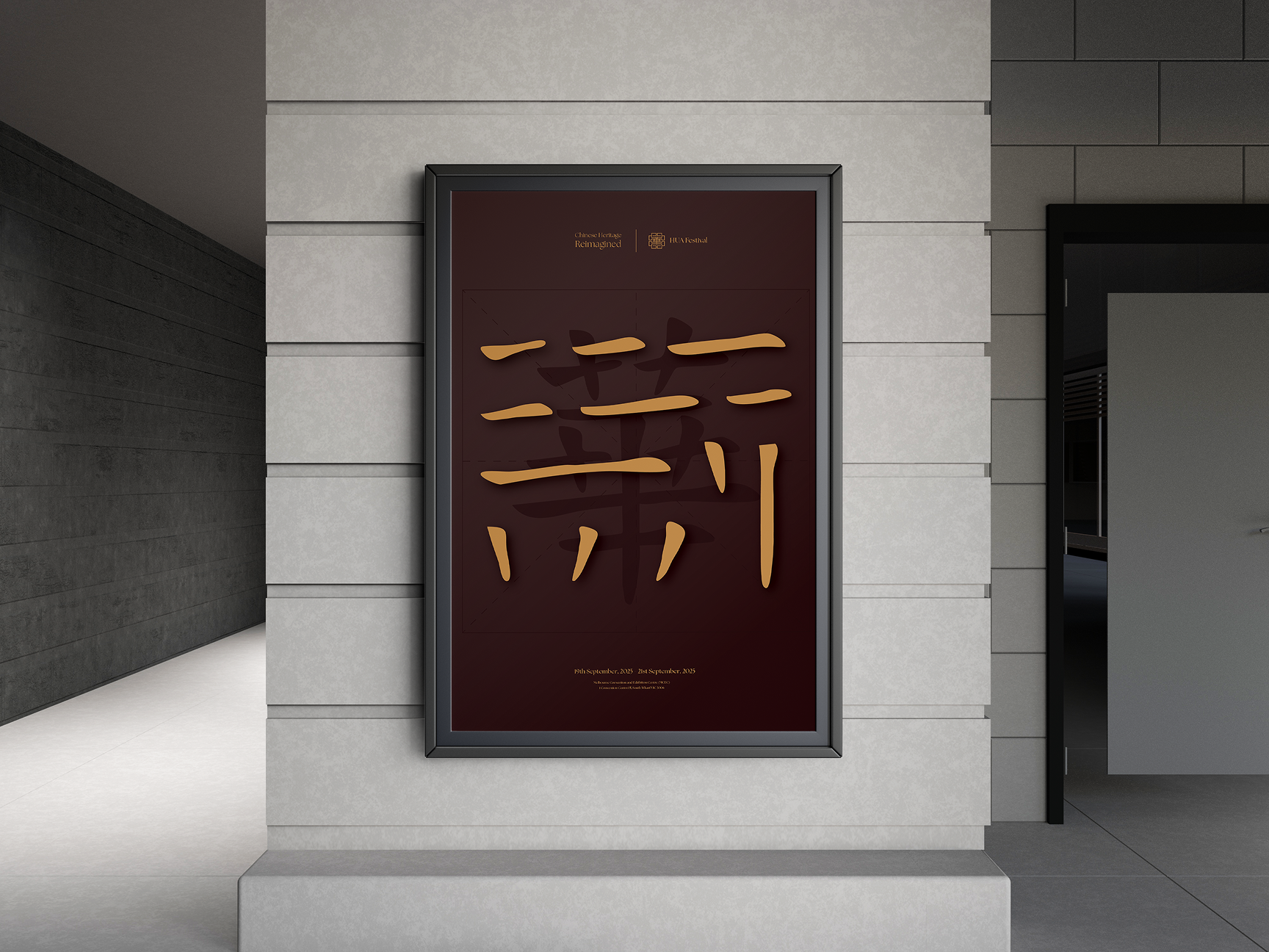
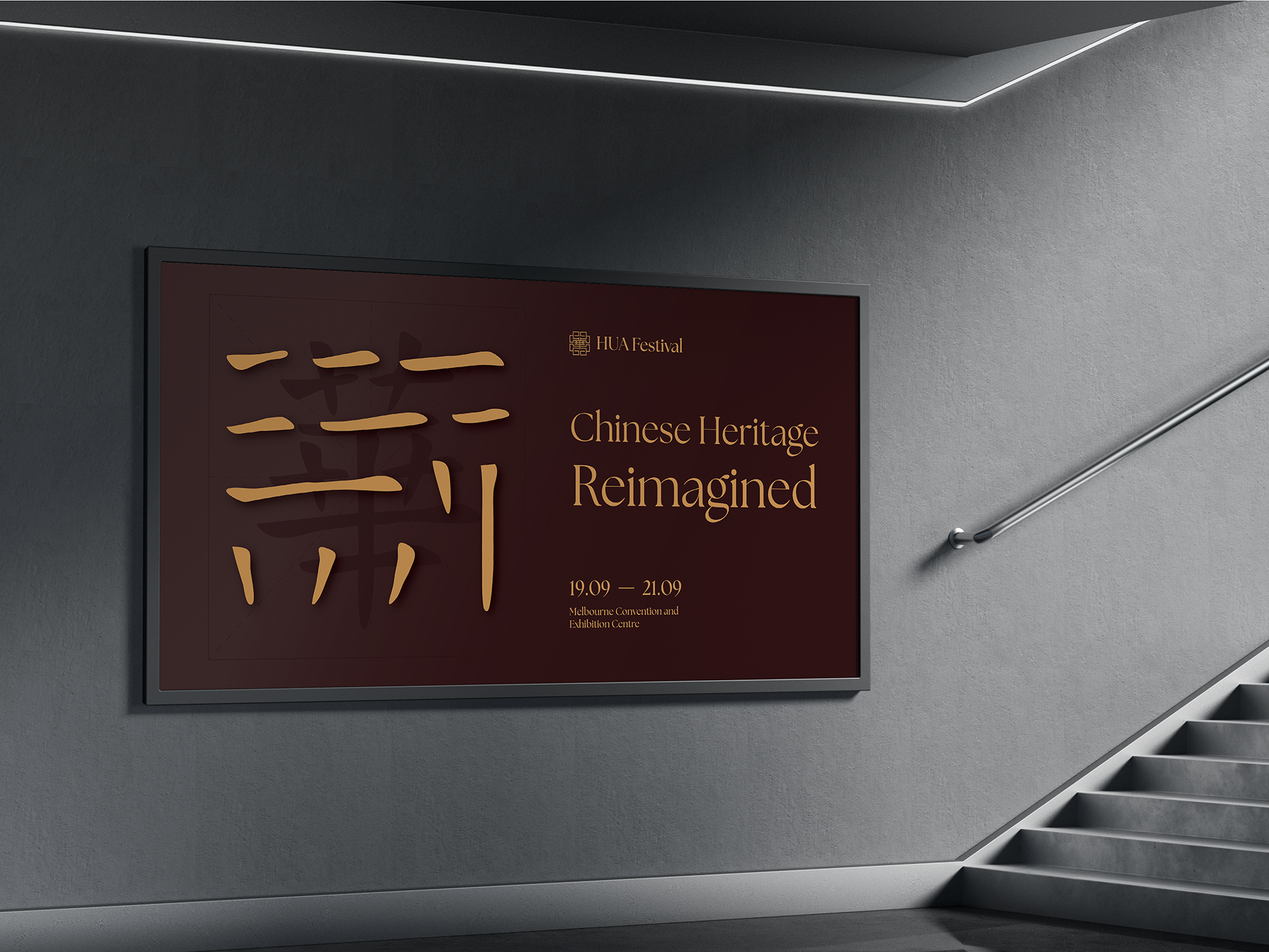
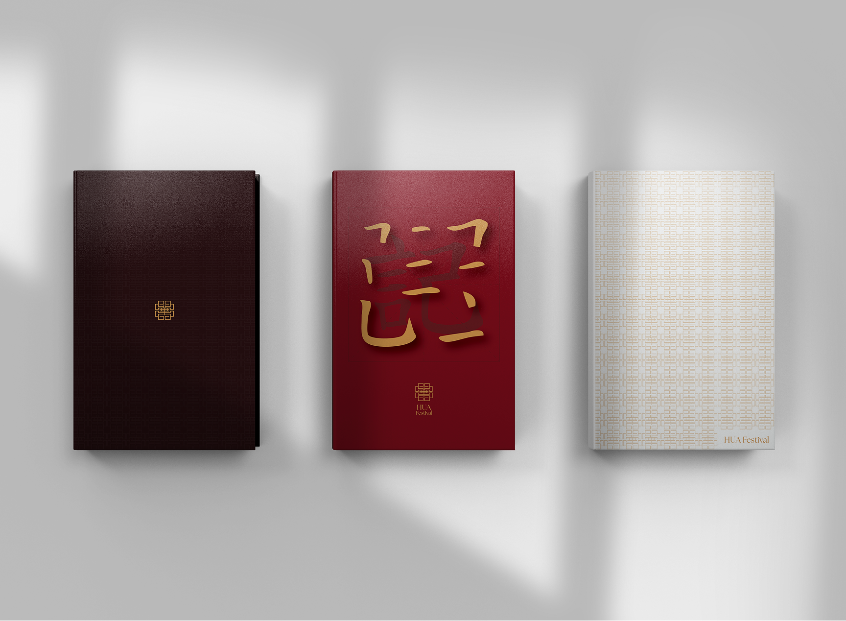
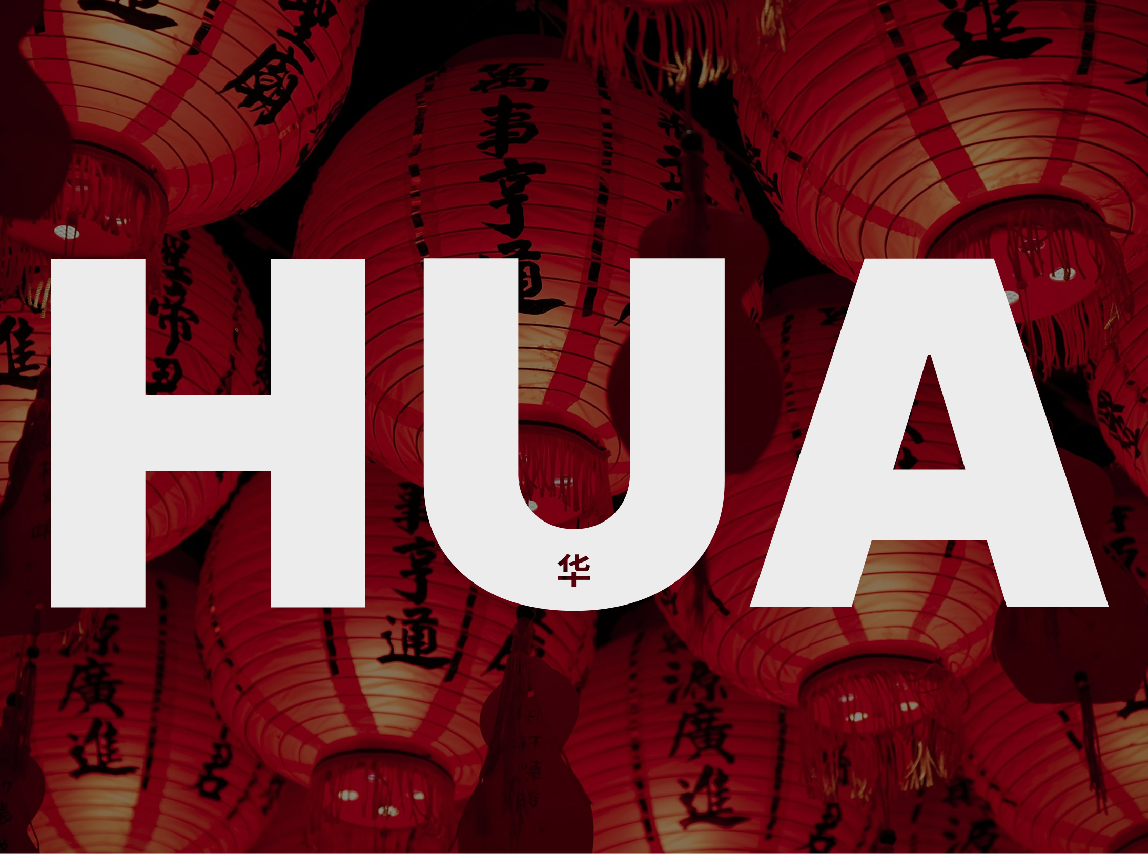
华 Hua
[ huá ]: Adjective
China, Chinese; time, prime of youth; flowery; splendid, magnificent; prosperous; extravagant
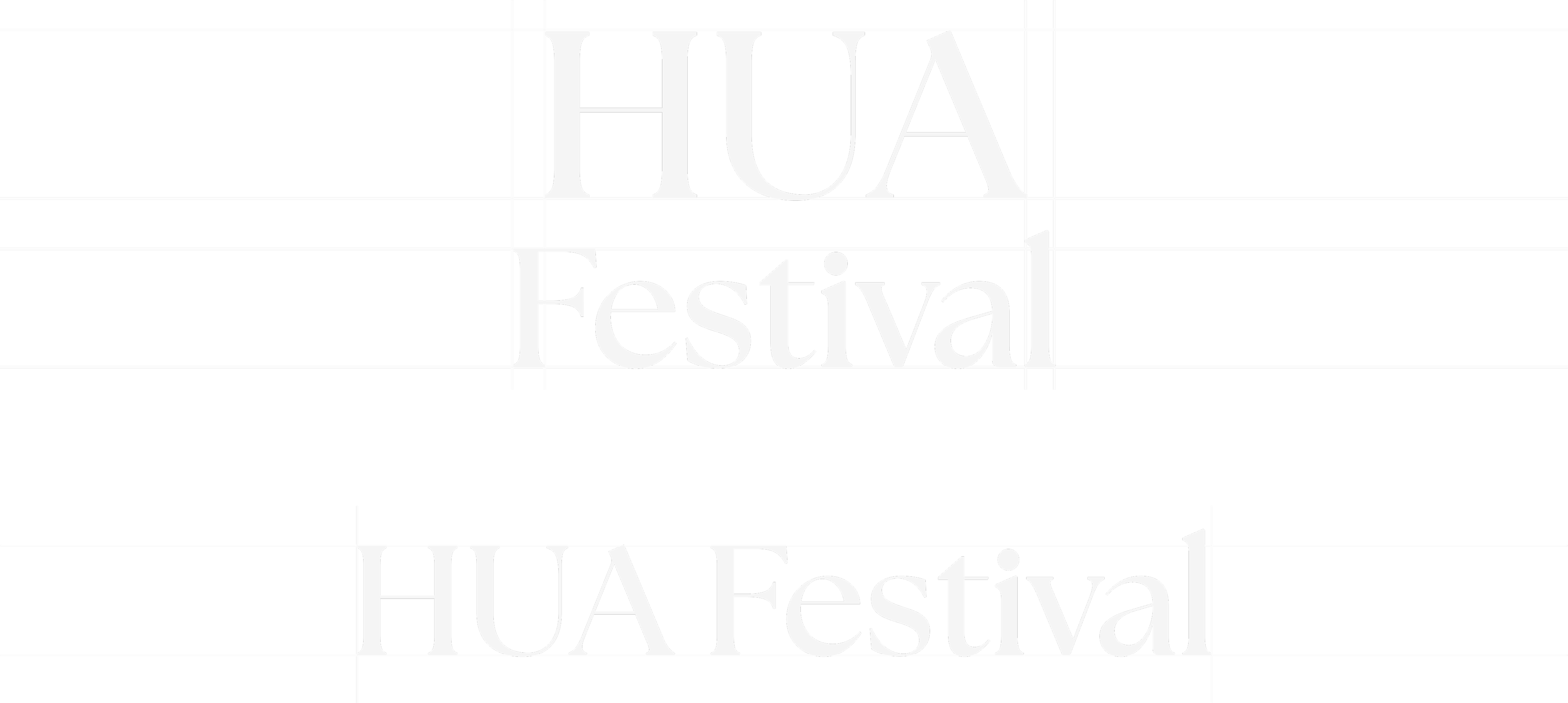
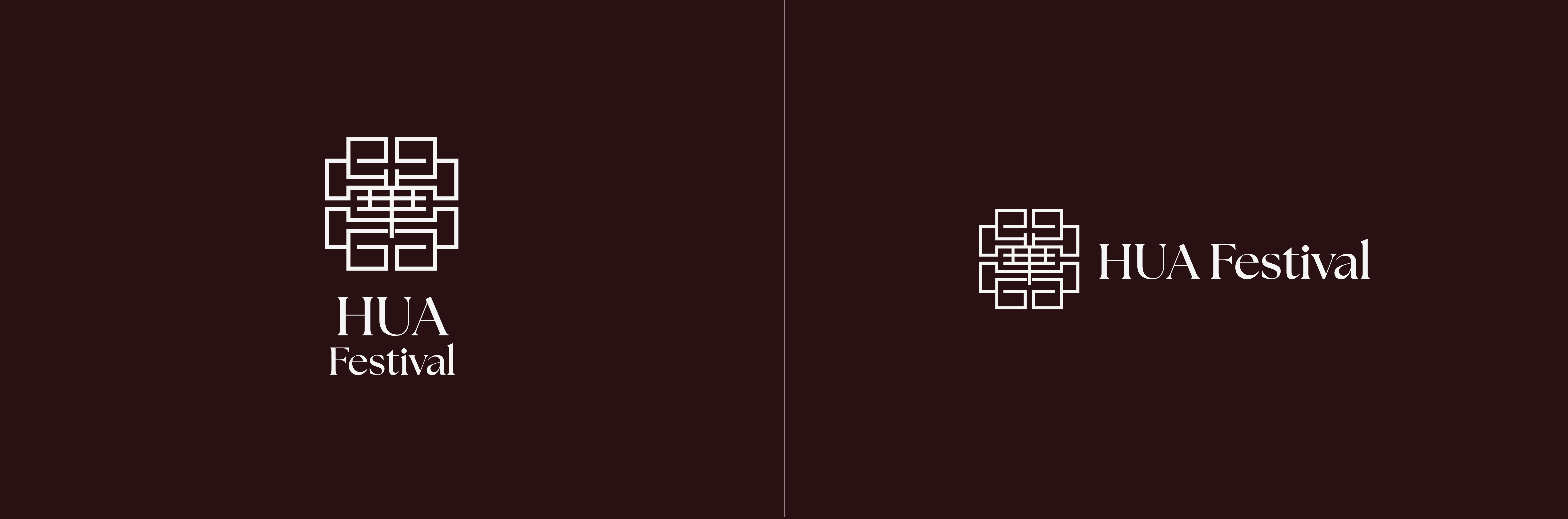
The name HUA (华) was chosen for its cultural depth, elegance, and branding versatility. In Chinese, HUA signifies splendor, refinement, and serves as a reference for China itself. This makes a powerful yet minimal representation of the festival’s essence, capturing the balance between traditional and modernity, along with heritage and expression.
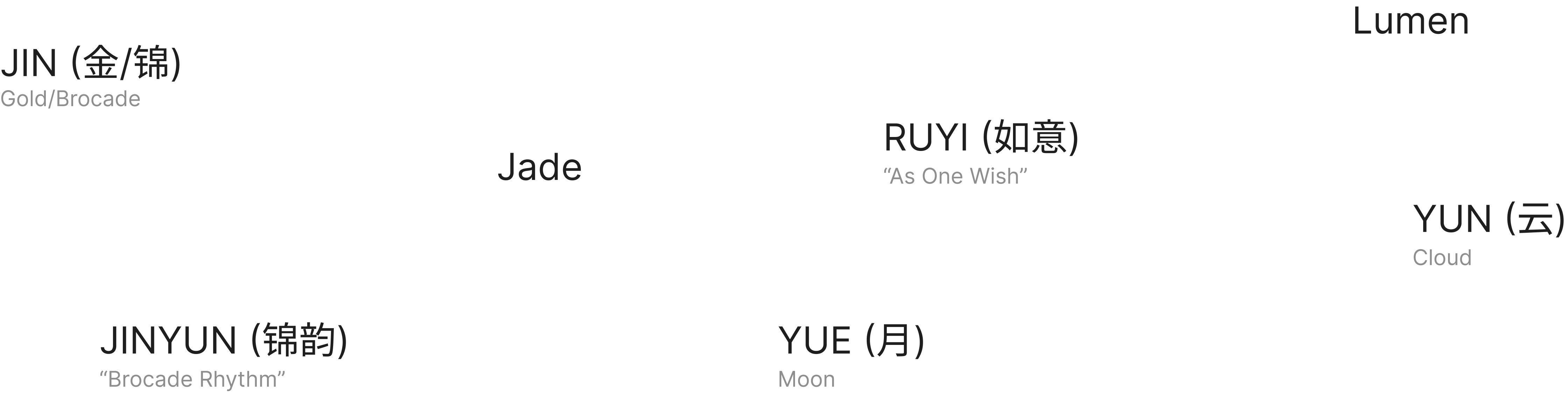
As a name, HUA is visually clean and easy to pronounce across languages. It’s simplicity allows for branding versatility for names such as:
As a name, HUA is visually clean and easy to pronounce across languages. It’s simplicity allows for branding versatility for names such as:
HUA Banquet
HUA Runway
HUA Gallery
HUA Evenings
HUA Experience
HUA’s symbolism, simplicity, and cultural resonance make it the ideal identity for a festival that seeks to elevate Chinese heritage in a refined, contemporary manner.
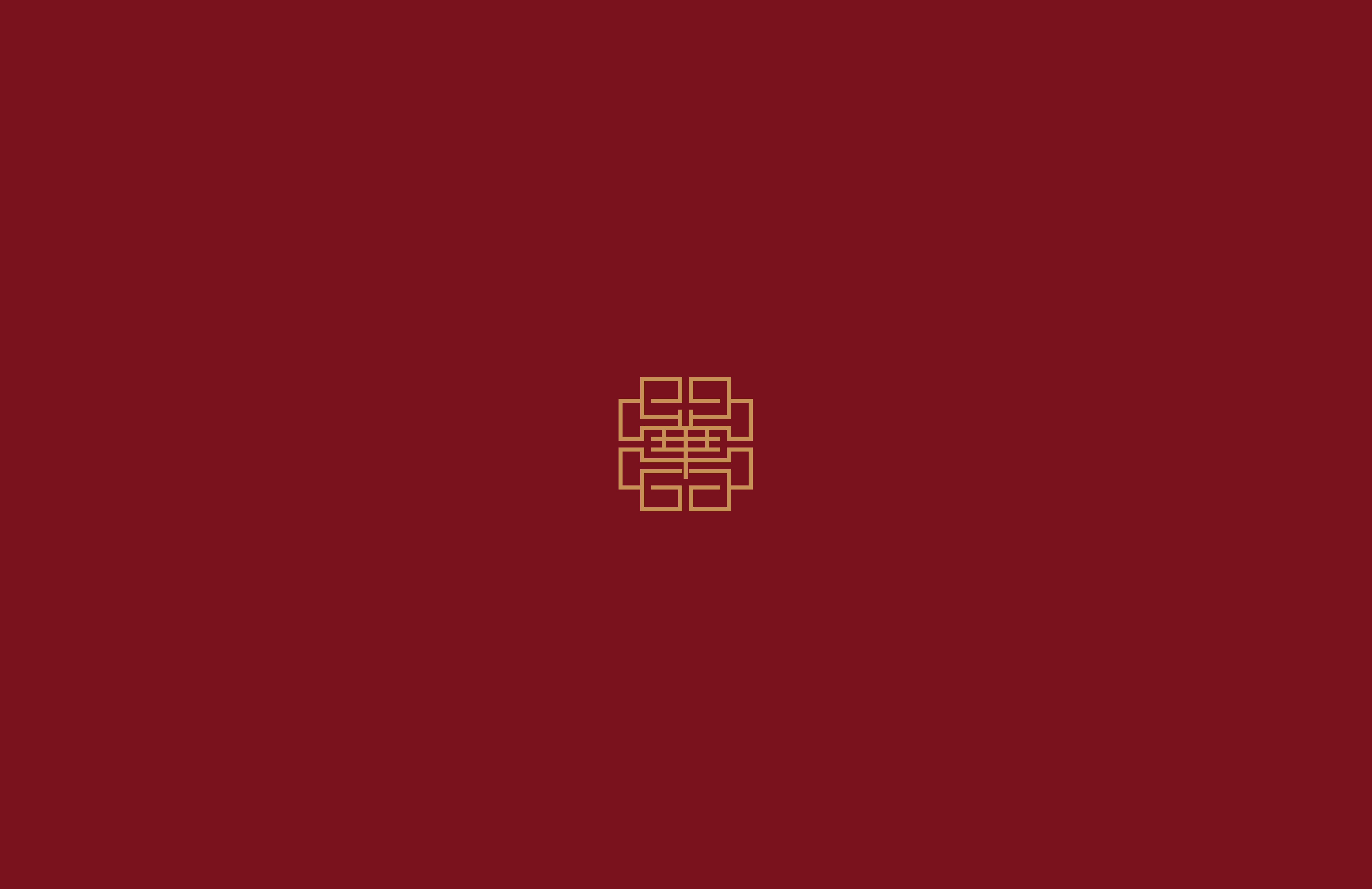
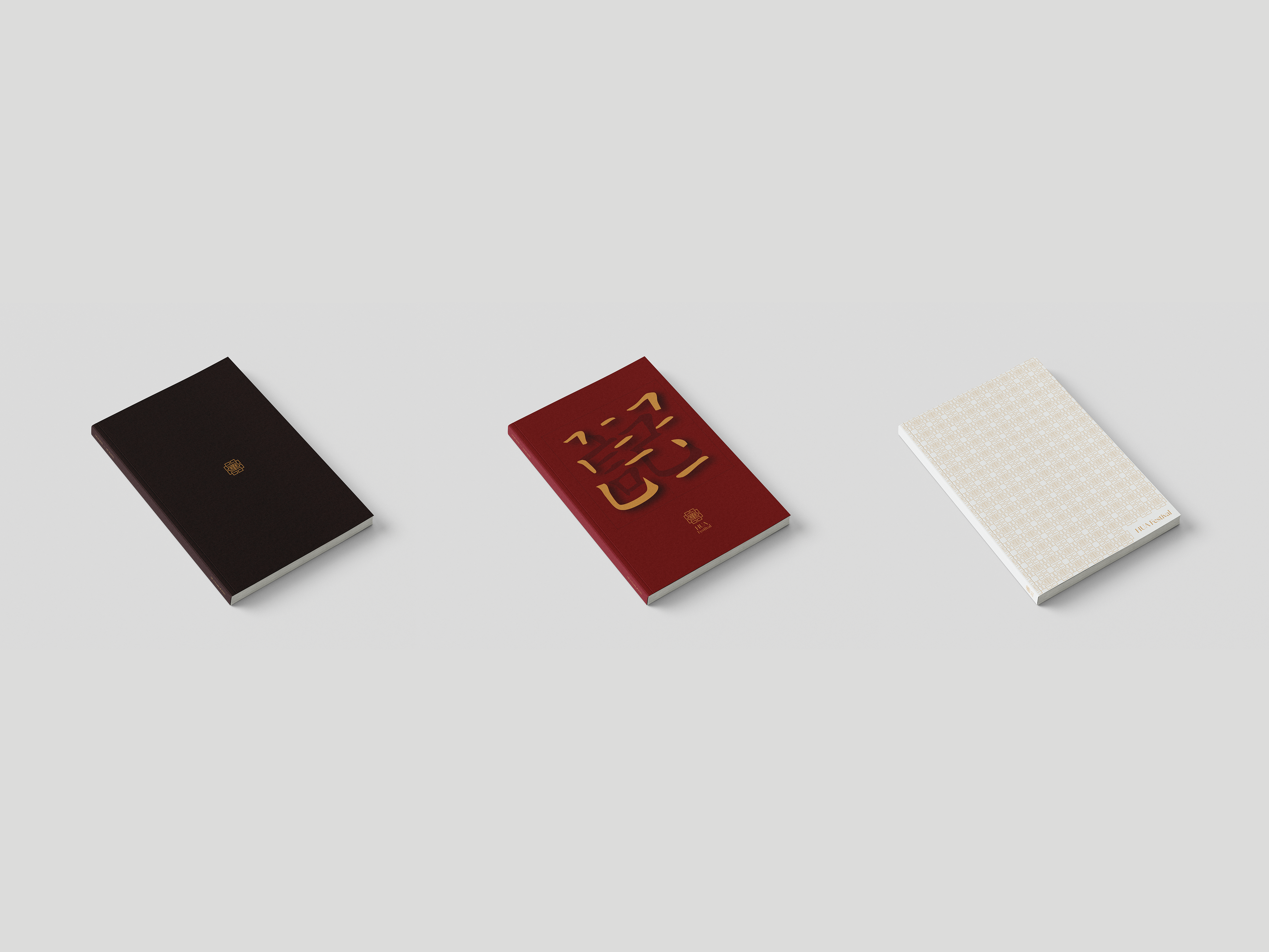
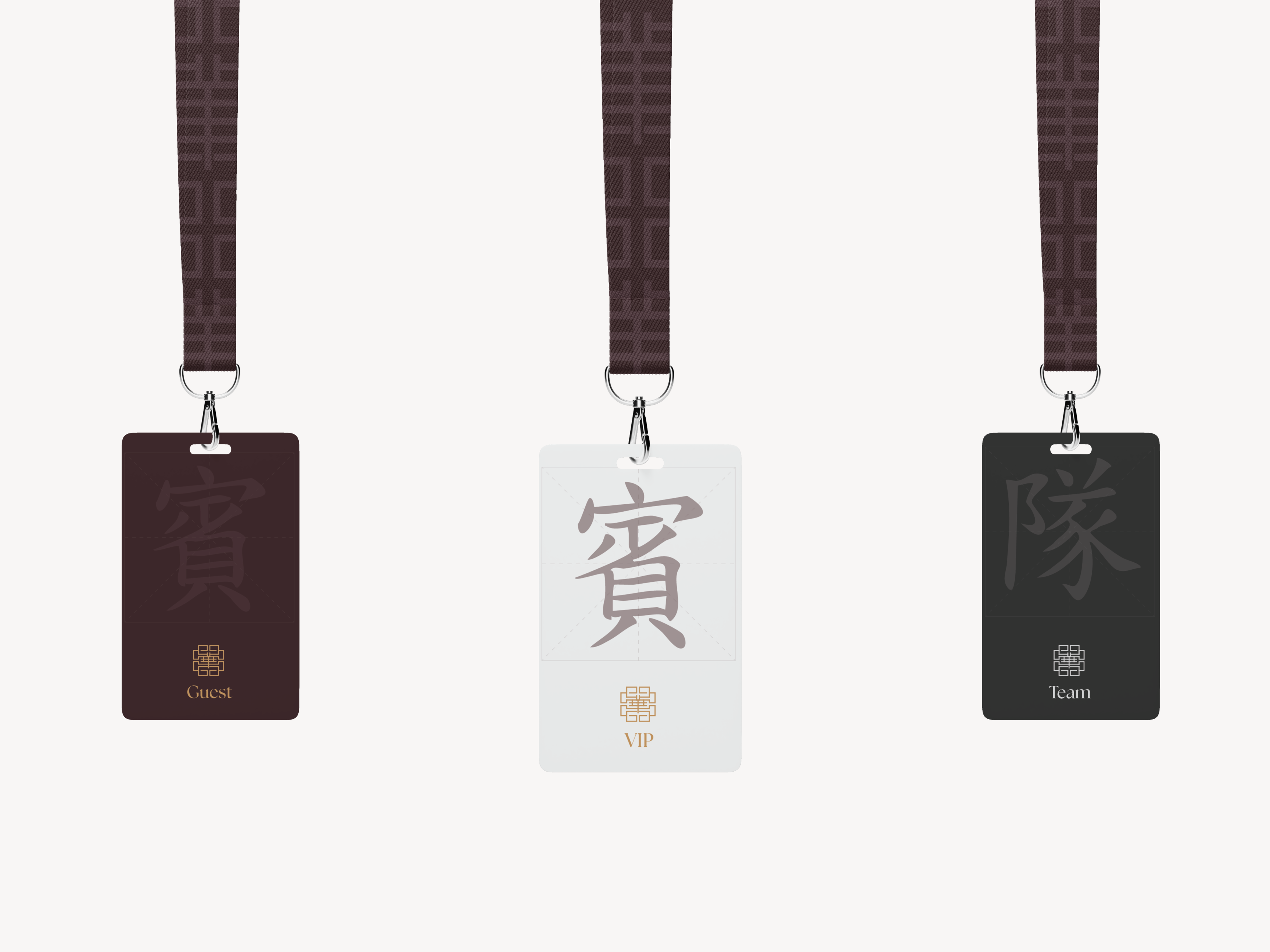
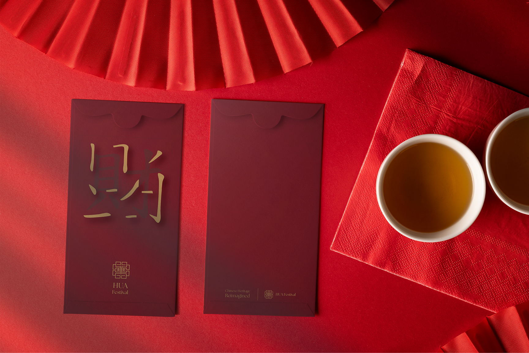
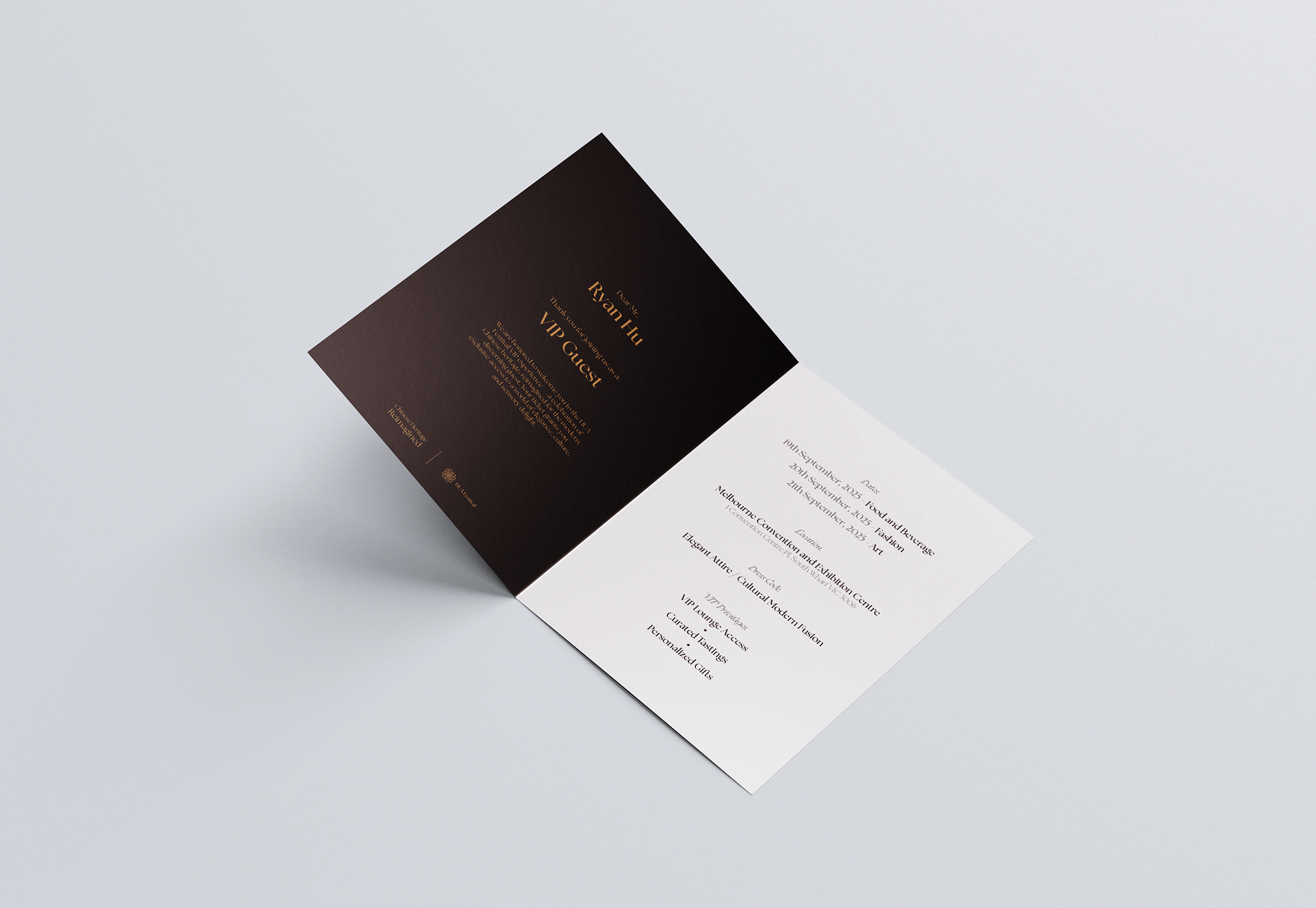
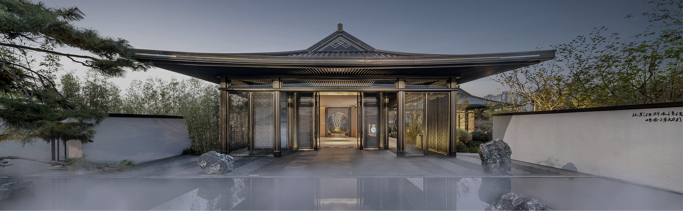
Final Concept
The concept of HUA (华) is simple: to reimagine and express Chinese heritage through a contemporary, elegant, and immersive lens. The festival is structured around the three core pillars - food, fashion, and art - where each is dedicated to a day of the program. Every element of the festive, from naming to visual language, would reflect a balance between authenticity and aspiration. HUA (华) position itself as a premium cultural experience, crafted for audiences who value heritage, aesthetics, and elevated experiences.